
Adding an interactive second digital experience layer to an epic Gwen Stefani tour.
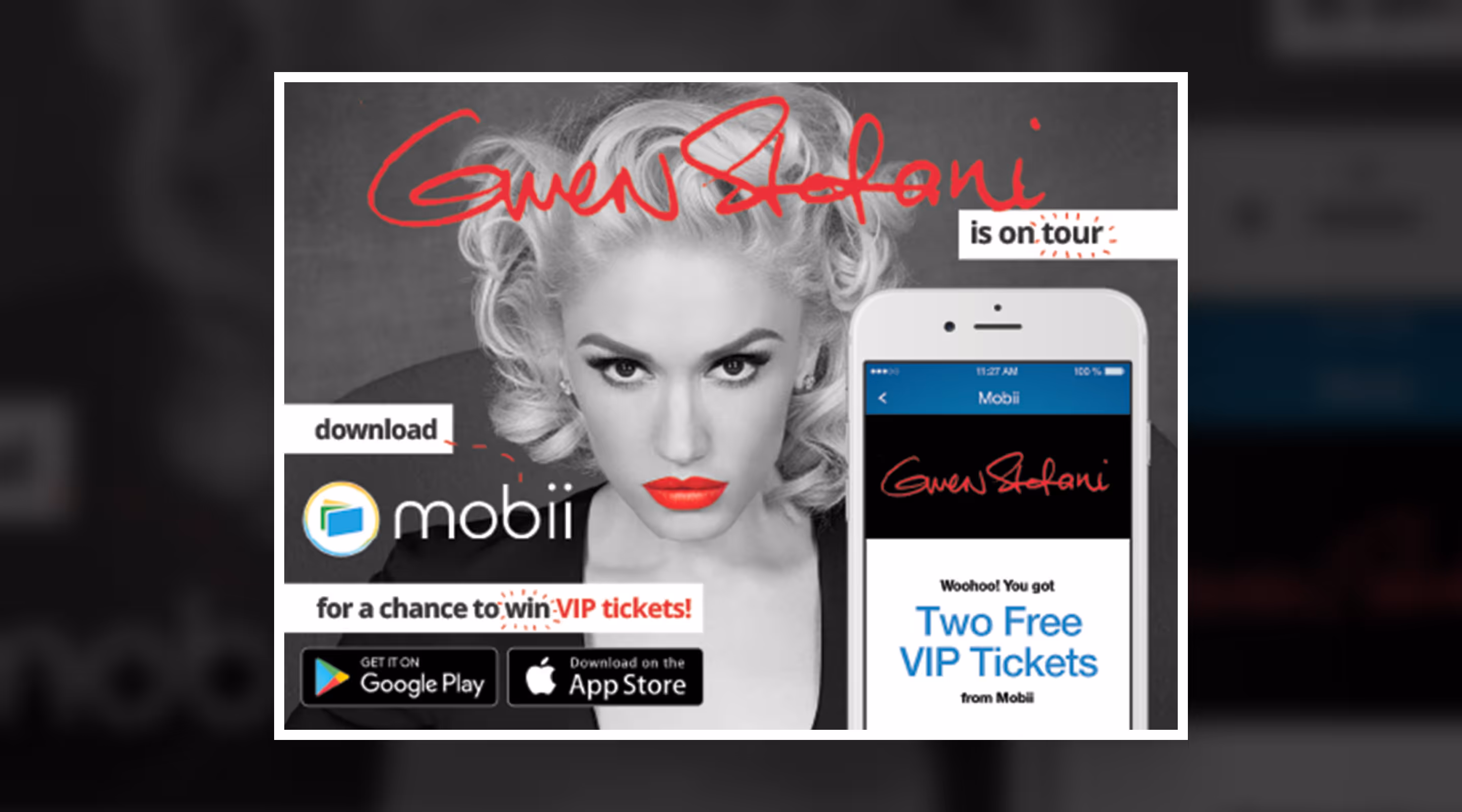
I designed and developed in-app content, microsites, and print materials to support the Mobii app deployment during Gwen Stefani’s 'This Is What the Truth Feels Like Tour', capturing and extending her onstage energy into the digital experience for users.
Experience Spotlight
Campaign Overview
Design for a multi-touch fan journey.
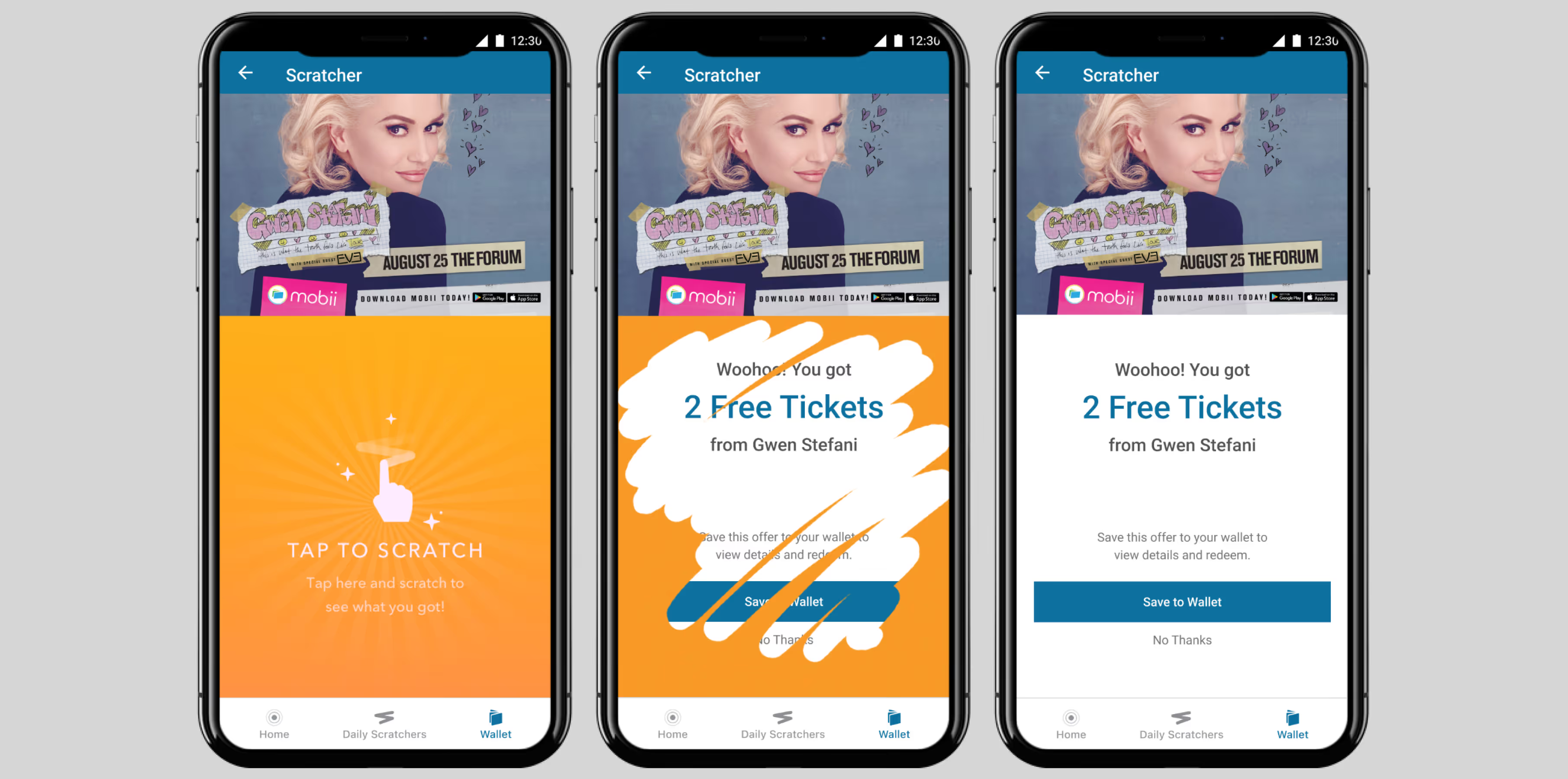
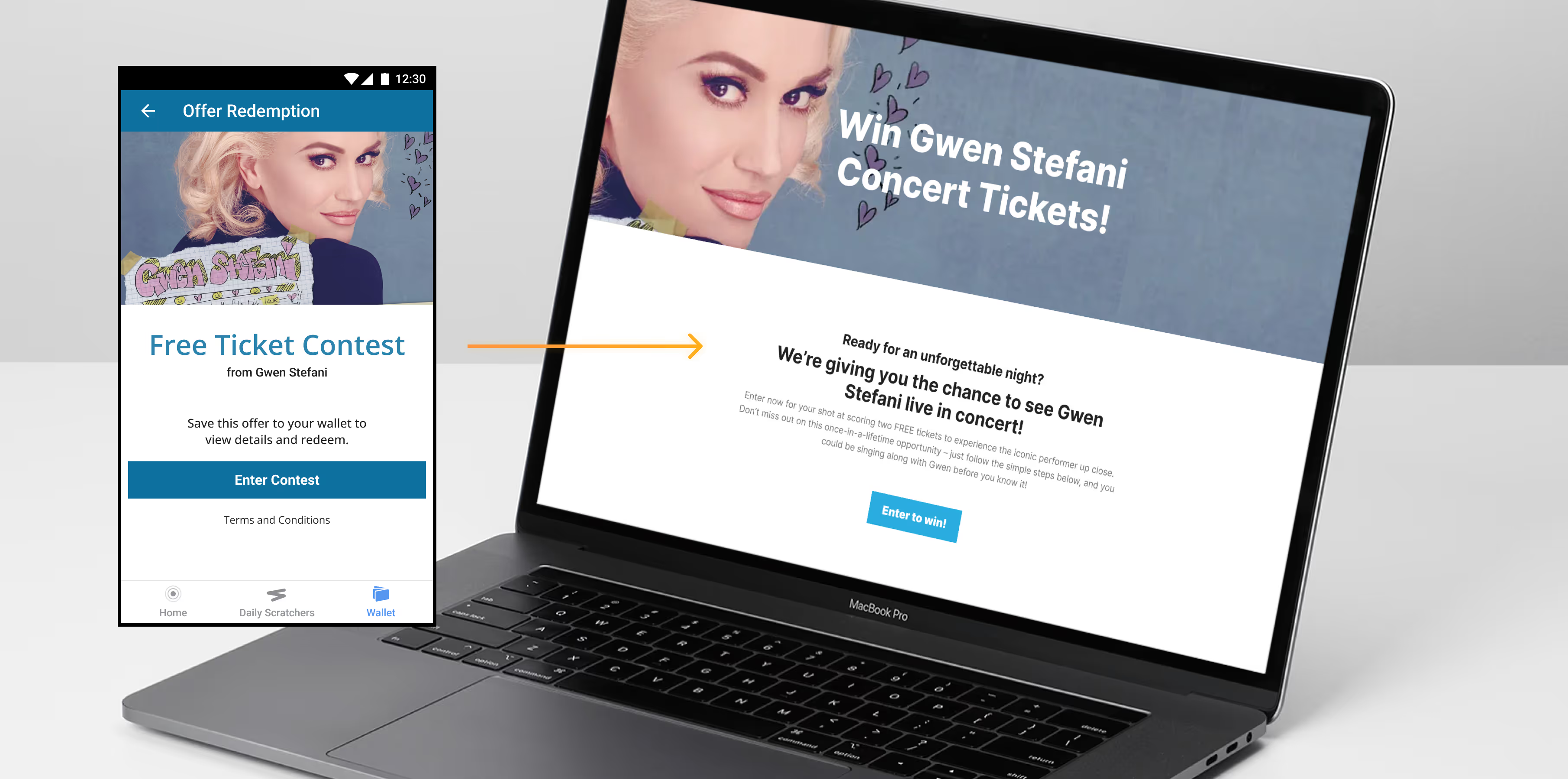
The tour promotion spanned several user entry points: an in-app content hub, microsites, and marketing collateral ranging from digital ads to printed posters. Everything needed to work together to build momentum, encourage ticket sales, and visually echo the attitude and artistry of Gwen herself, all in concert with our partners.
Speed & Scale
Challenge
Create a unified experience across platforms for a modern music icon.
ACTV8me needed a cohesive campaign in addition to the current tour's brand that touched print, digital, and in-app content. With a mix of live dates, marketing pushes, and surprise content, the challenge was to think in a visual system flexible enough to work across our product while still feeling undeniably like Gwen's tour flavor infused by ACTV8me's technology. A dual brand voice in a fast-paced deployment and iteration cycle with short instantiation windows.
Systems First
My Approach
Templates and tools for rapid rollout.
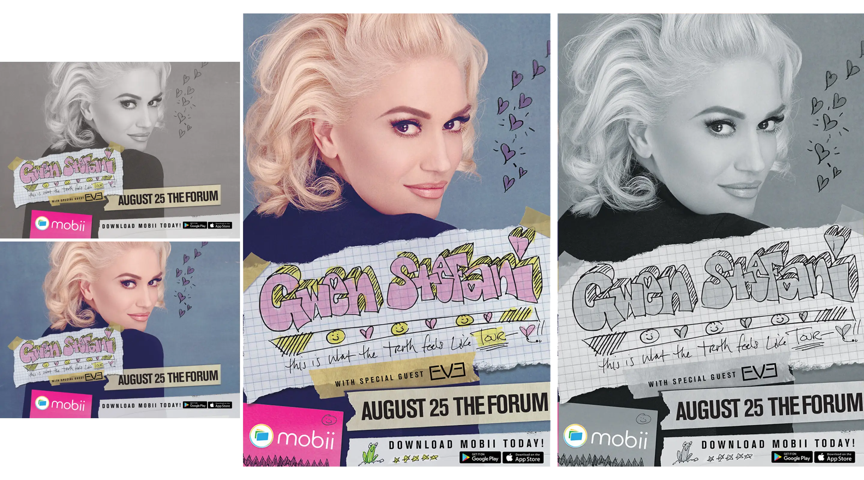
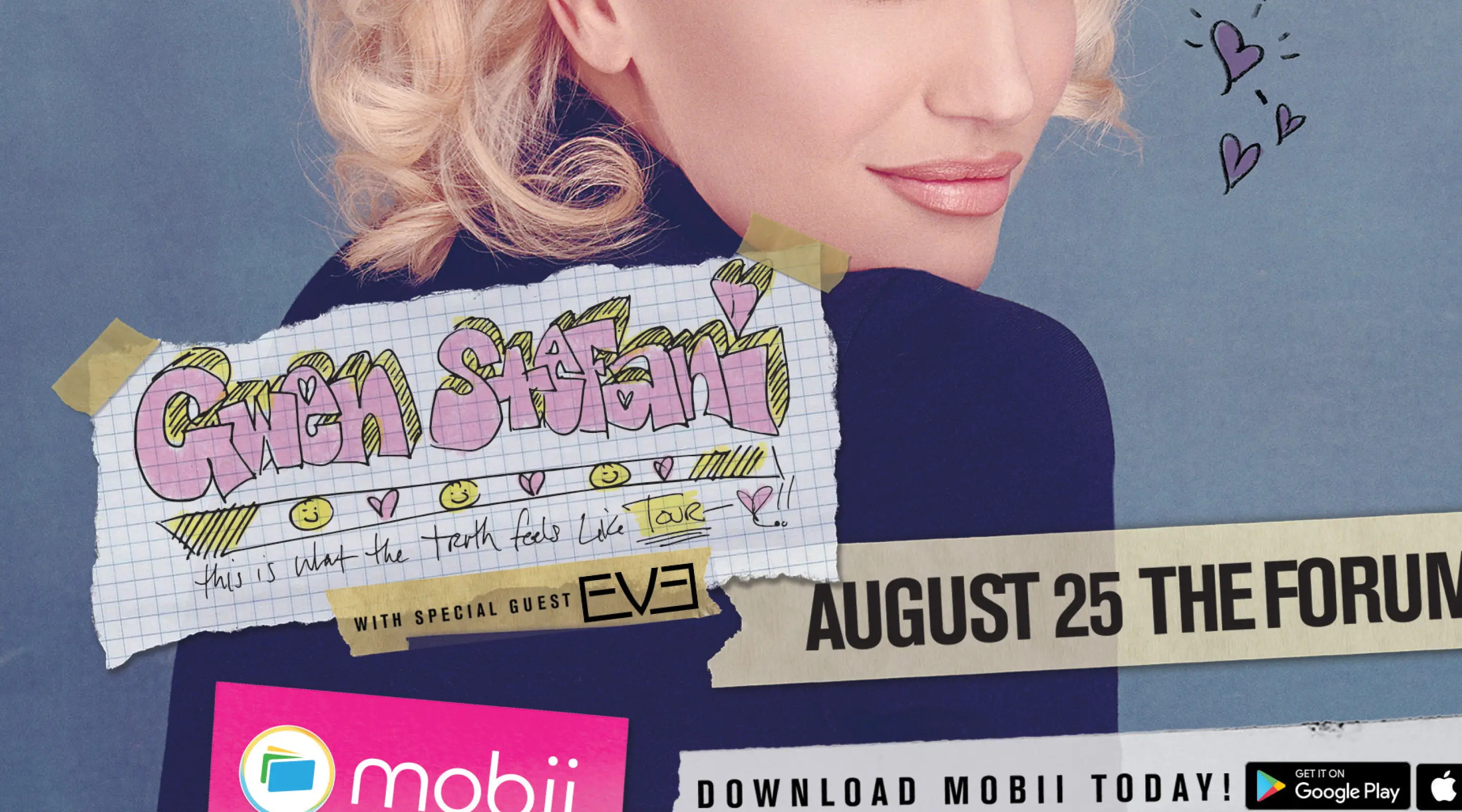
We began with Gwen’s tour style and design established by the team working on the official campaign and used it across our product support: app, print and web. I designed and maintained interactive microsites that had both a core branded message from our partners as well as experiences that mirrored the feel of what our content team was currently doing in support of ACTV8me (the black and white concept below didn't make it... it was one of my concepts, it hurt a bit).
Personal growth
Impact
A fan-forward digital presence that elevated every touchpoint.
The microsites acted as a branded hub and helped drive interest and clicks with dynamic content in support of the app (and also let me experiment every once in a while), physical print was carefully planned and distributed, while in-app content offered a seamless flow of updates and engagement. This coordinated triple front helped provide a cohesive experience across marketing layers for us on the design (and for me web also) team, tying it all together.
Contact Me
Have a project or problem to solve?
Use my form, send me an email at hello@johnhansen.design or schedule a call.