
Branding an AI tool for a human connection
Logo, color, and type system for Reach-a-Human. A brand identity focused on clarity, approachability, and trust.

Overview
People First
An AI tool that puts people at the center.
Reach-a-Human was a tool designed to skip the robot and get users to a real person, fast. I developed a small brand system for this startup that feels human, direct, and trustworthy, reflecting the product’s mission. Deliberately small and crafted for flexibility.
Concept
Clear & Caring
A calm voice in a noisy world.
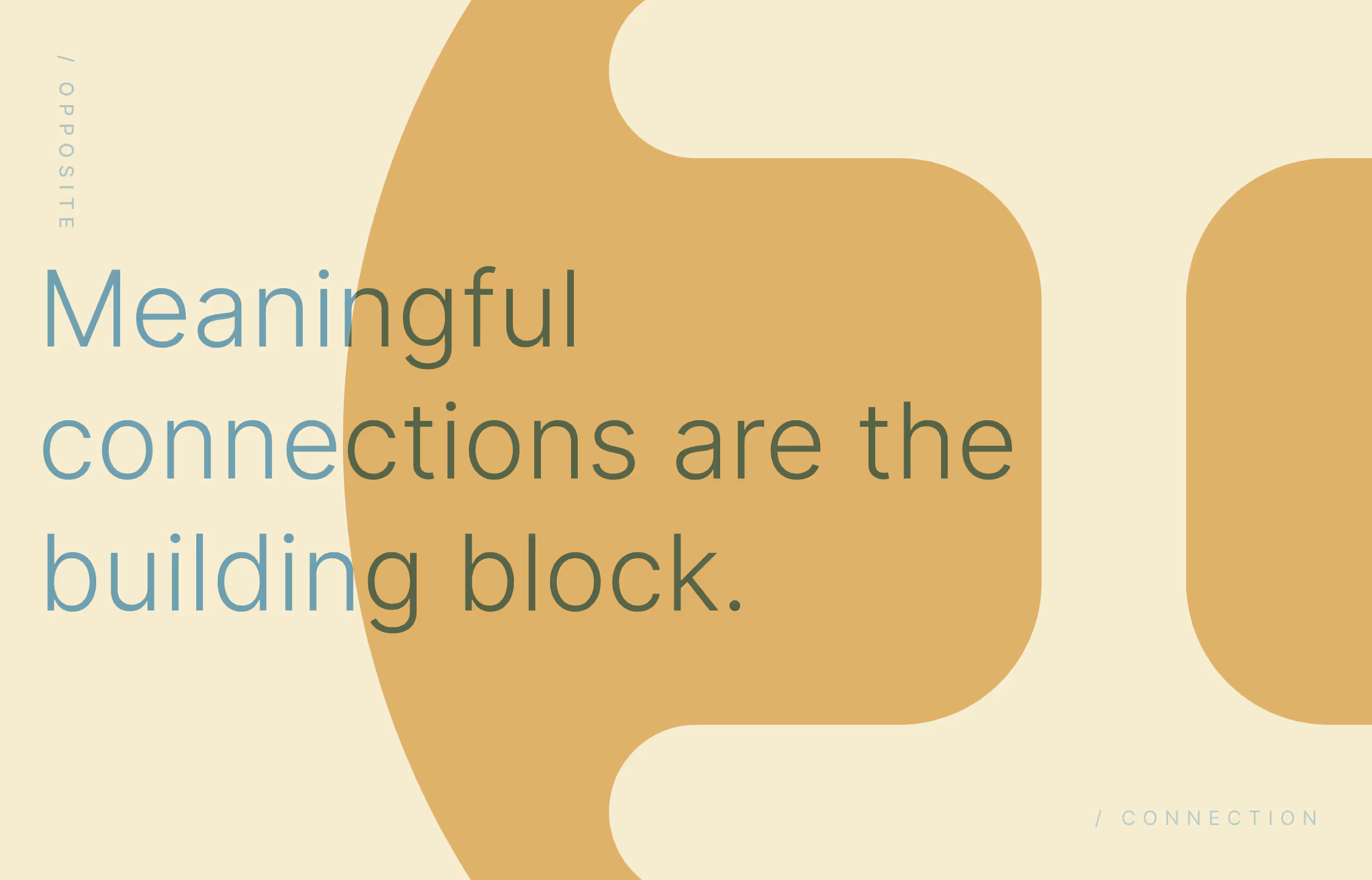
The logo is approachable and structured, blending utility with warmth; It's influenced by the Japanese Kanji for 'construction' both visually and in meaning. Color choices favor calm tones with a modern edge (achieved through diffusion which is conceptually what's happening). Typography is functional but friendly, emphasizing accessibility and clarity without losing personality.


Deliverables
Visual Expression
Identity essentials for brand consistency, for stability —— for connection.
I designed a foundational identity system including logo, type, color, and visual examples. Each element was designed to carry the brand’s tone across product, web, and marketing with consistency and ease.


Reflection
Clarity First
When the concept drives the identity (as it should), clarity follows.
This project reminded me that simple ideas, when distilled just right, can create lasting brands. Reach-a-Human’s visual system proves that being human and being digital aren’t opposites.
Contact Me
Have a project or problem to solve?
Use my form, send me an email at hello@johnhansen.design or schedule a call.