2013 design School Portfolio.
Designed at a beach in Los Angeles, California. Crafted in my apartment on Venice Boulevard. Bound at a printer in downtown Los Angeles. It's meant to symbolize a peculiar relationship between art and industry while demonstrating concepts I'd learned during my studies
——— graphic design.

0/ Overview
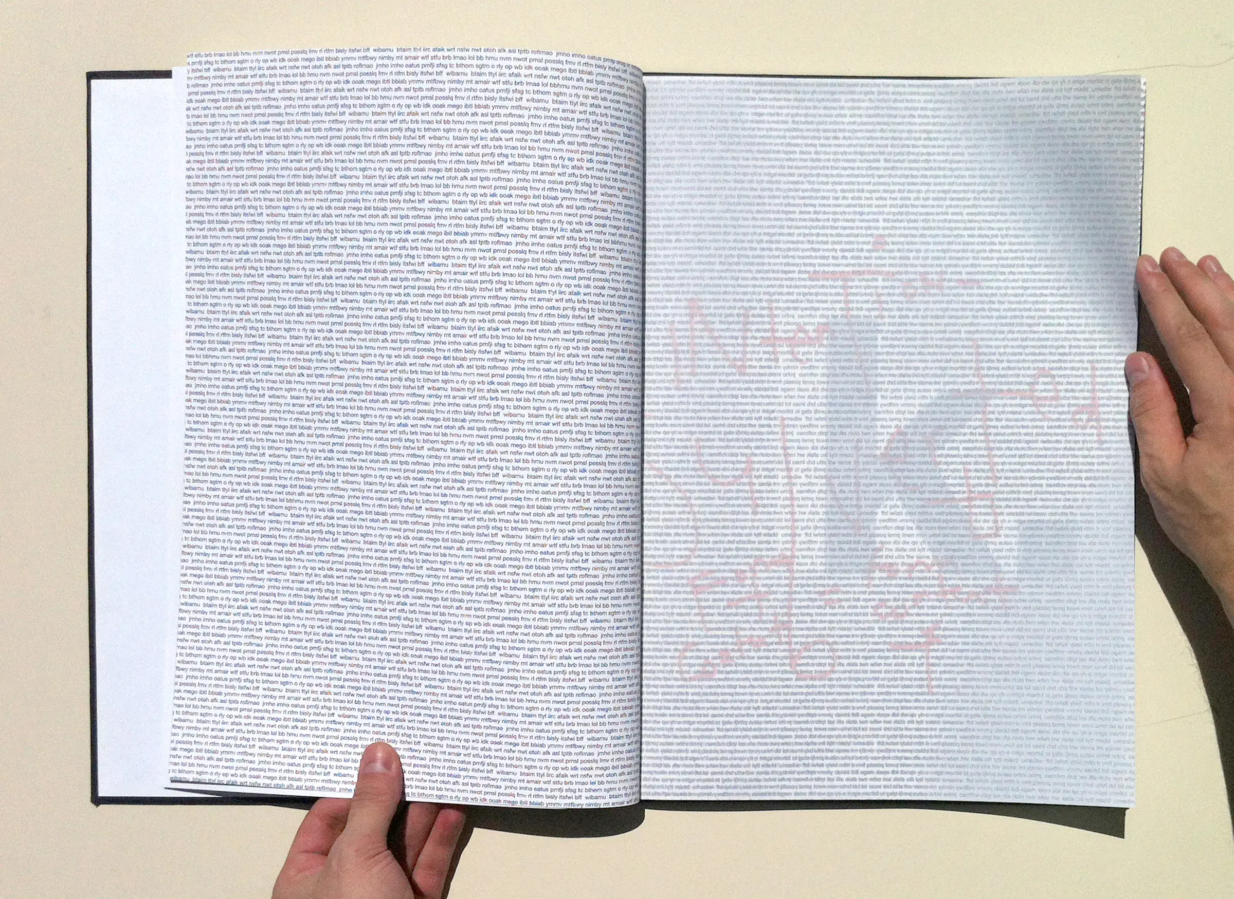
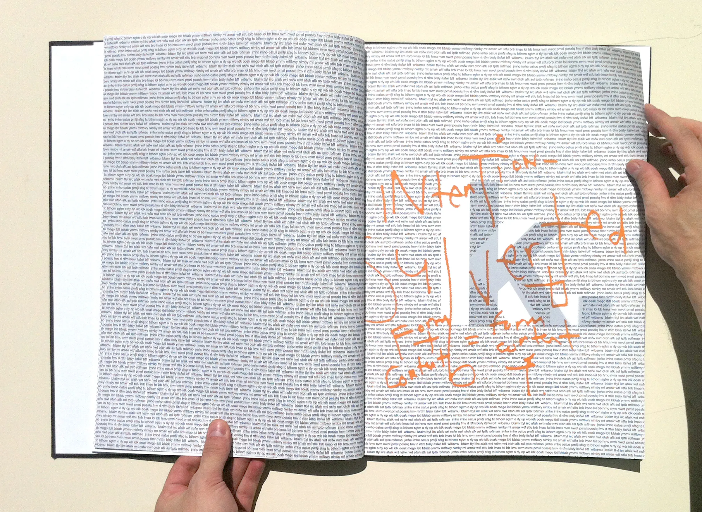
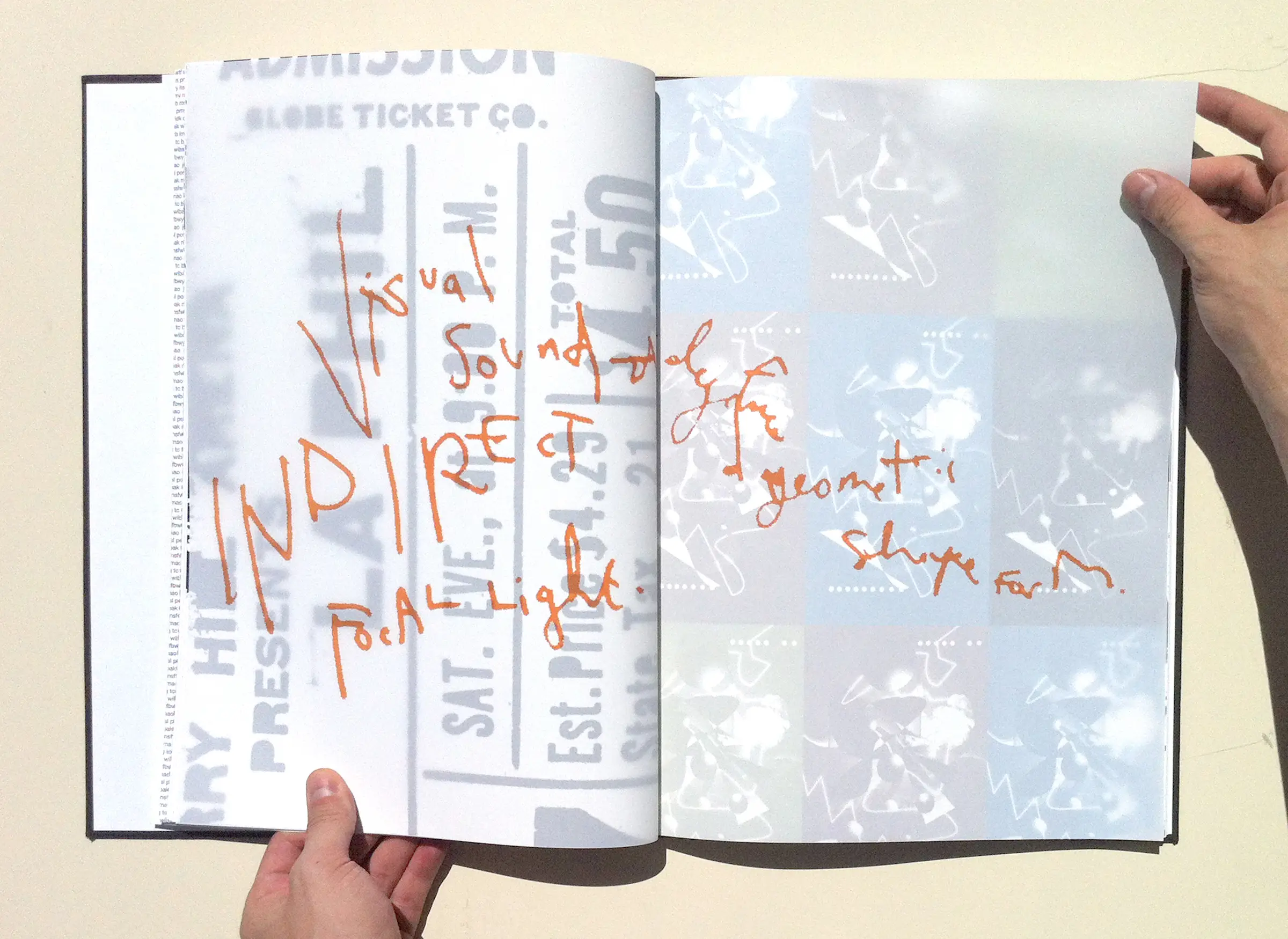
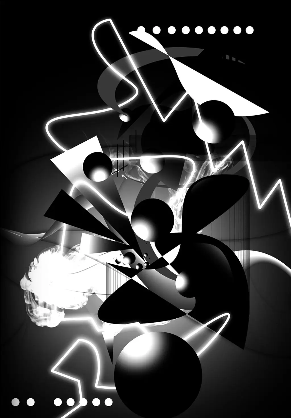
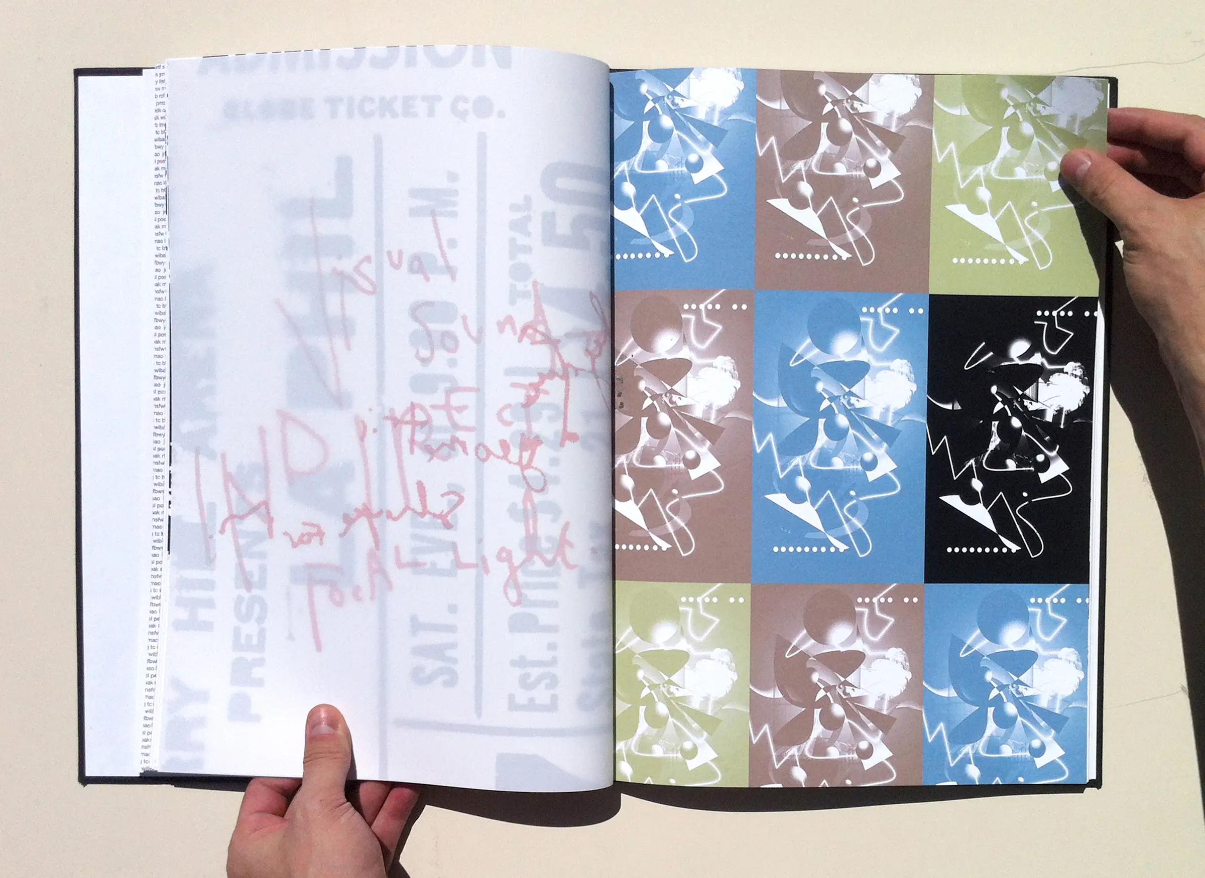
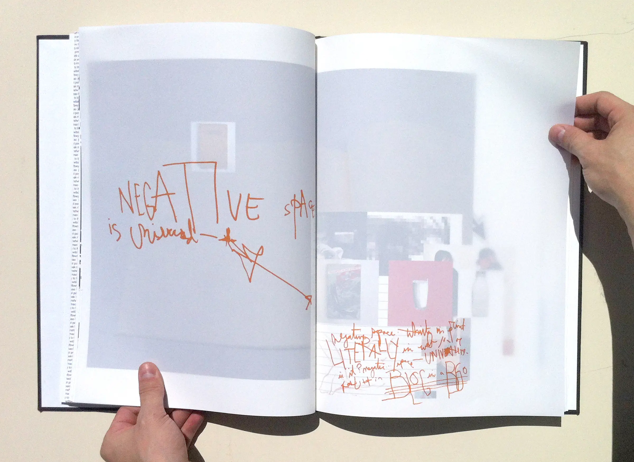
thoughts and experiences I had while studying graphic design in Santa Monica, California after a series of substantial personal events which collided. I condensed my internal experiences through work and then into a book for my final portfolio. I crafted it using vellum pages printed with my original notes divorced from their origin source and altered by my new technical capabilities to illustrate the emotive part of this experience.
I tried to capture my evolving ideas throughout my studies, it was important to me.
The ideas and resulting artifacts were merged and physically combined with very heavy, nearly absurd and almost impossible, page stock ironically showcasing the prints of my work bound in an understated, dark, hardcover and deliberately drone book printed and finally bound in old-style in downtown Los Angeles throughout a bustling three days.
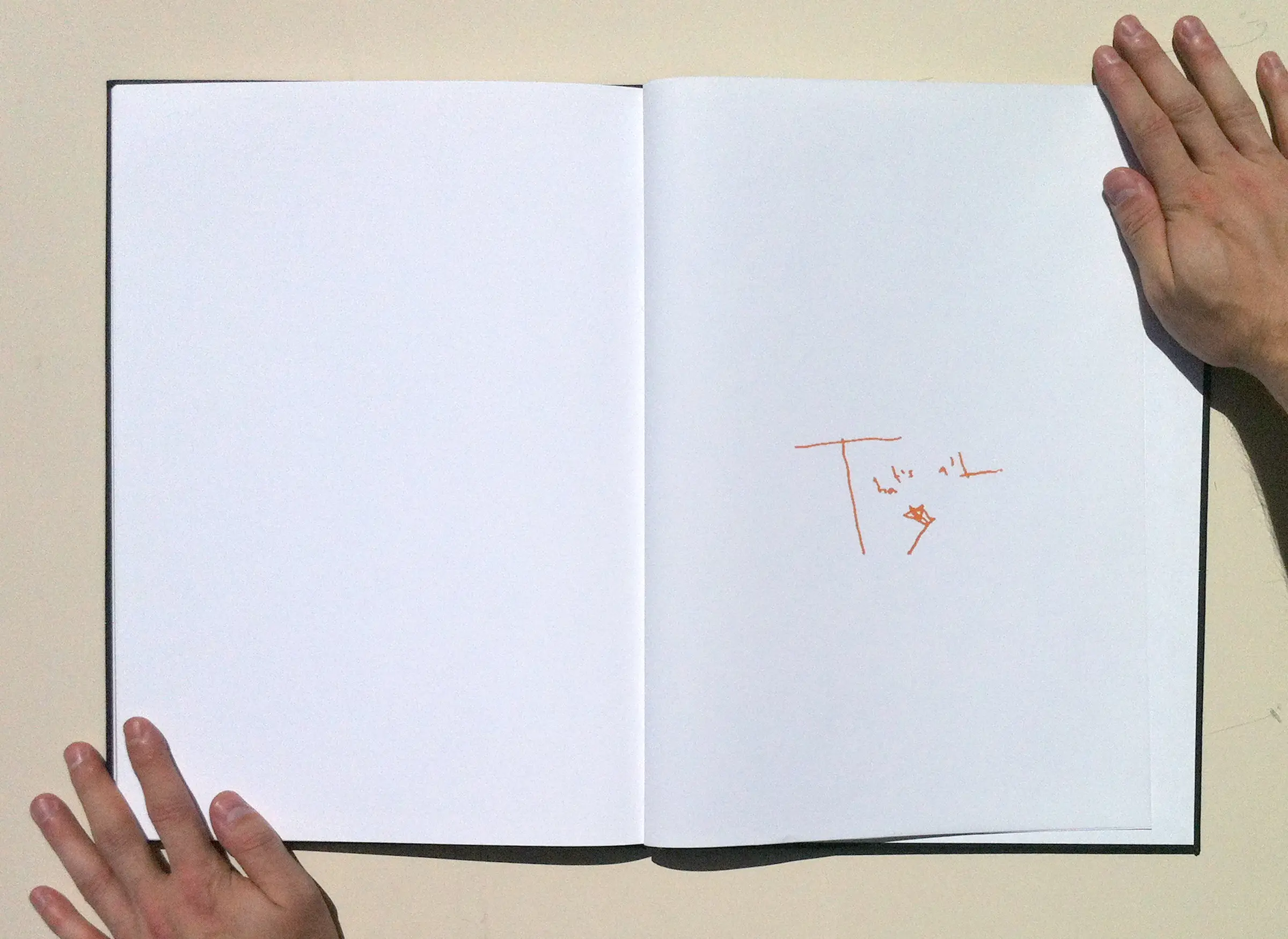
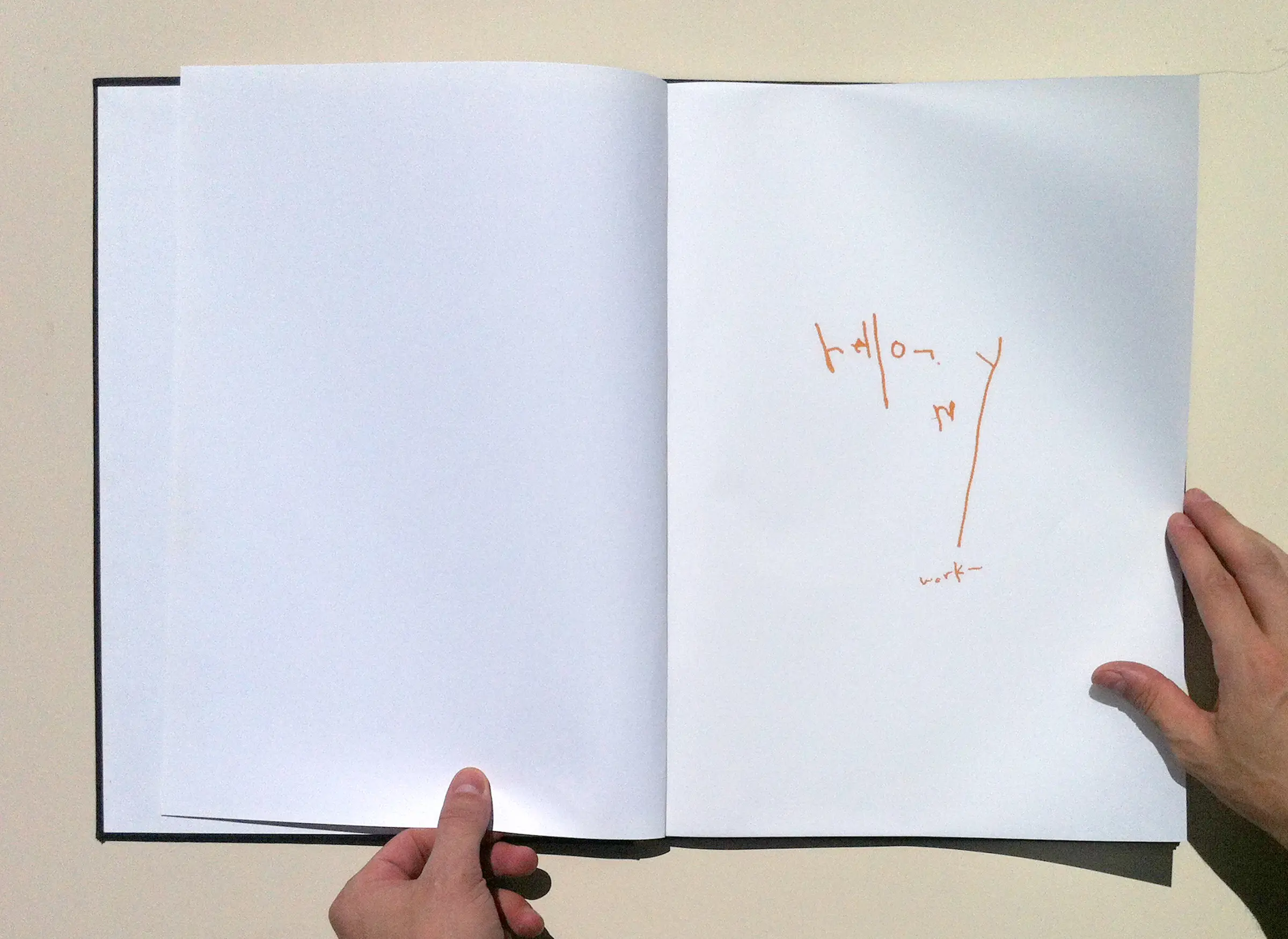
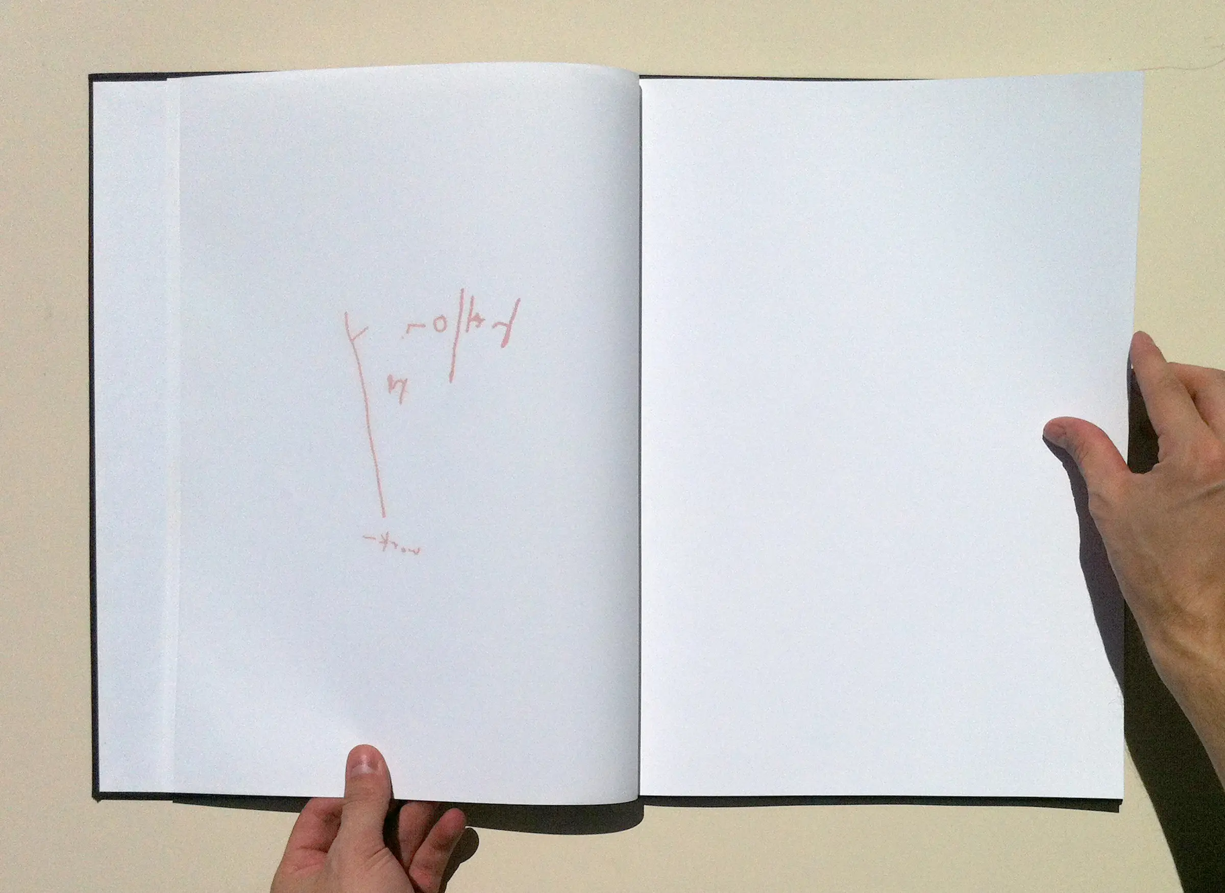
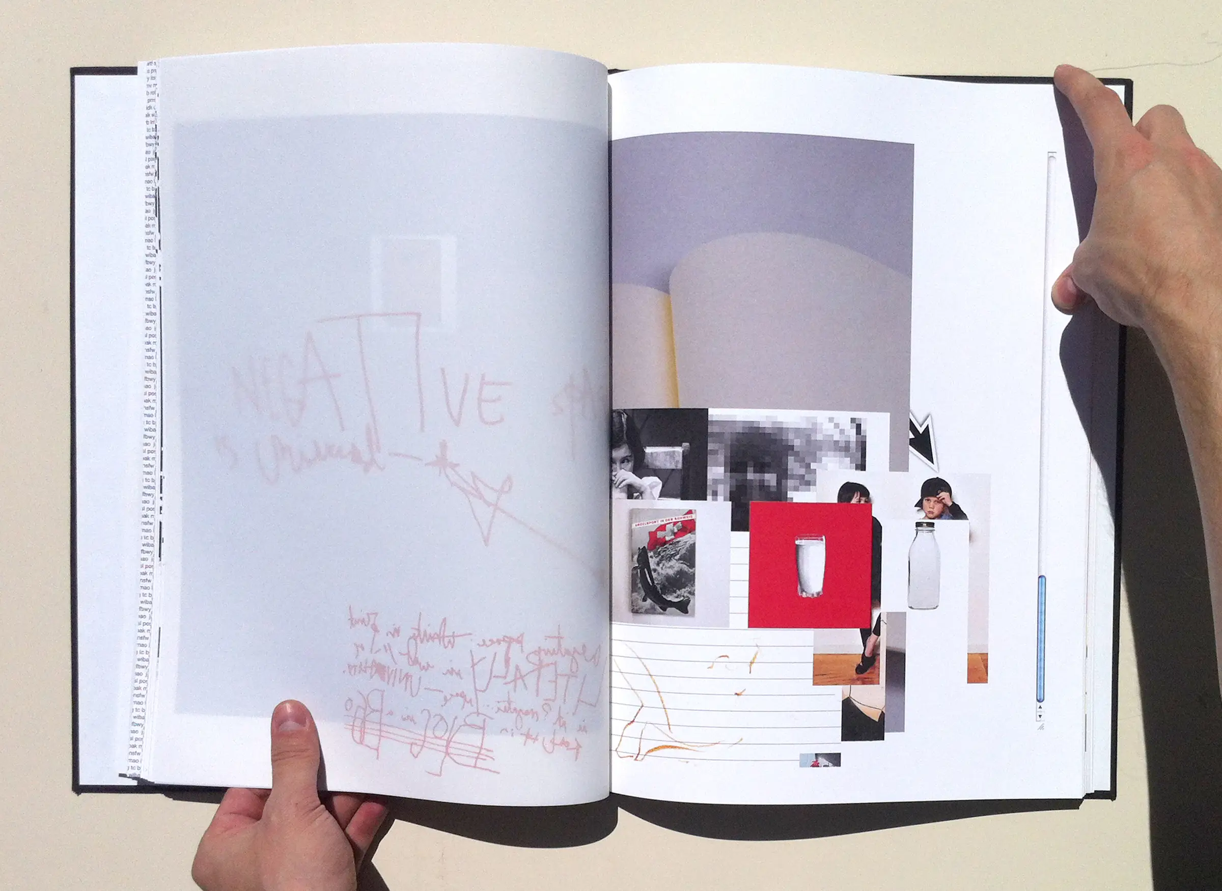
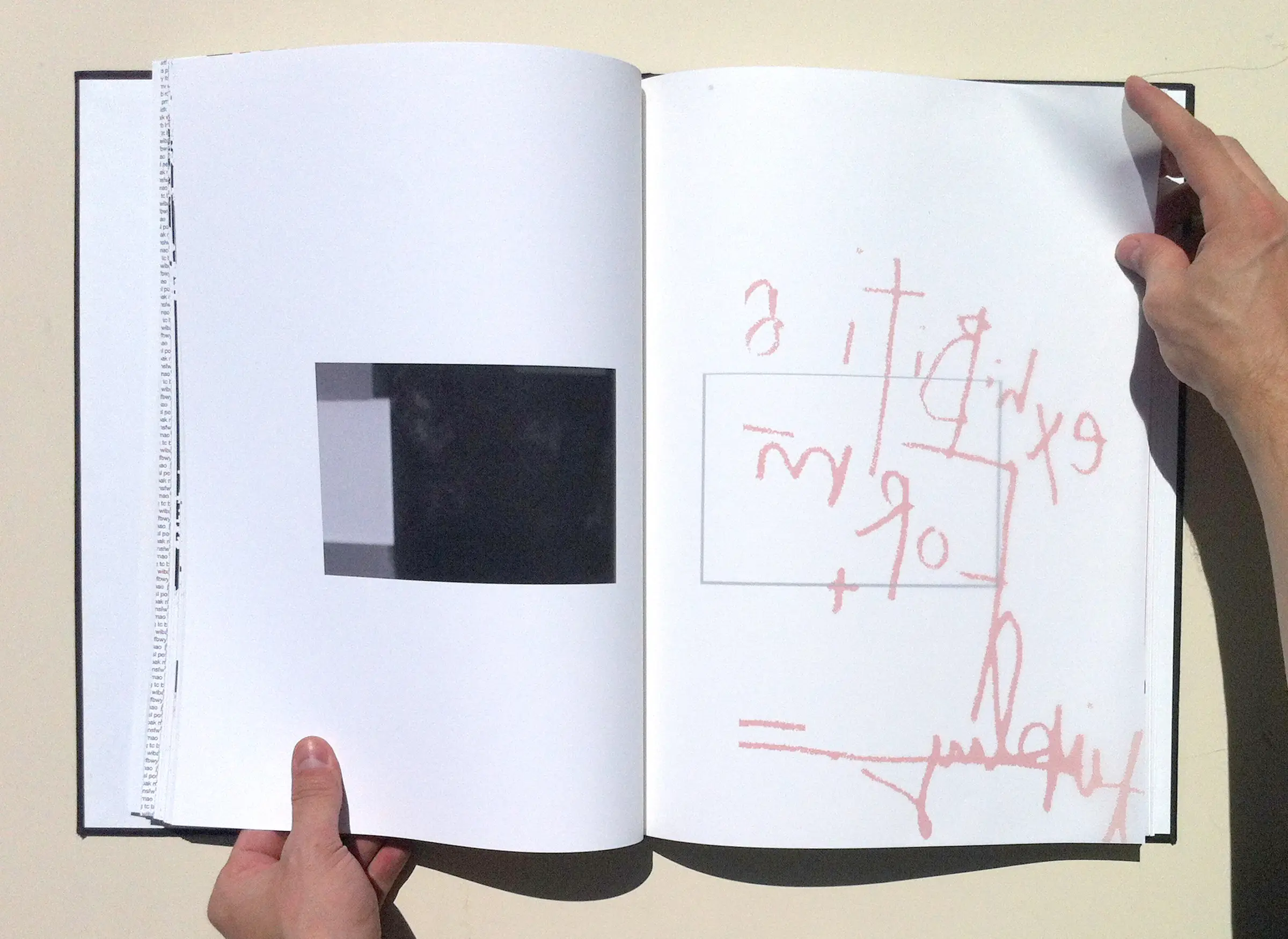
I used vellum pages to house my notes so as to overlay my resulting work to give a sense the primal form which was then refined and presented through a contextual layer. The work I presented:
1/ On me
using space with hand over vellum, intimate. To introduce me without content, just context. A suggestion of de-emphasis.
2/ On subverted Intentions
4/ On the essentiality of Sound
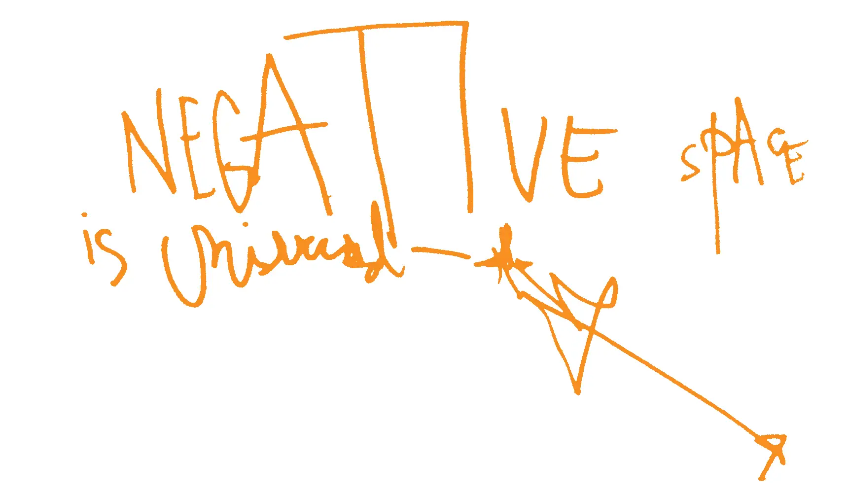
4/ On white space
4/ On exhibition


5/ On Constance
This isn't all of it, but it's enough of the core pieces to get my concept and craft across.
I really enjoyed building it, the stress, the required focus and craft ——— though it exceptionally challenging and presented several special stresses. It essentially combined everything I learned put together in one compact project, then crafted with almost every tool and strategy I'd been studying put into one of the most permanent formats: print. Then I was made to explain it over and over at the portfolio show.
During my portfolio showing I was wearing a blazer and trousers I'd gotten special for the event from the Men's Wearhouse. I despised both articles because they were both too snug and too expensive for my situation ——— regardless, I was made to present and explain my work through this discomfort, which I think was very powerful for my personal design growth. This is precisely what I'd been looking for.
I navigated through the design program deliberately as I went to school on the GI Bill (which can be a significant challenge by itself) during a precarious time in life so I wanted to ensure I got the core. This was a fortunate tactic because an issue with compensation occurred and prevented me registering for my final quarter. Instead, I started working at Oubly starting with designing stationery.
One of my extremely talented instructors - Sheridan Lowrey - invited me back later to present my book with future classes and discuss my concept and process with students much to my honor.