Interaction Redesigned
Experience Direction
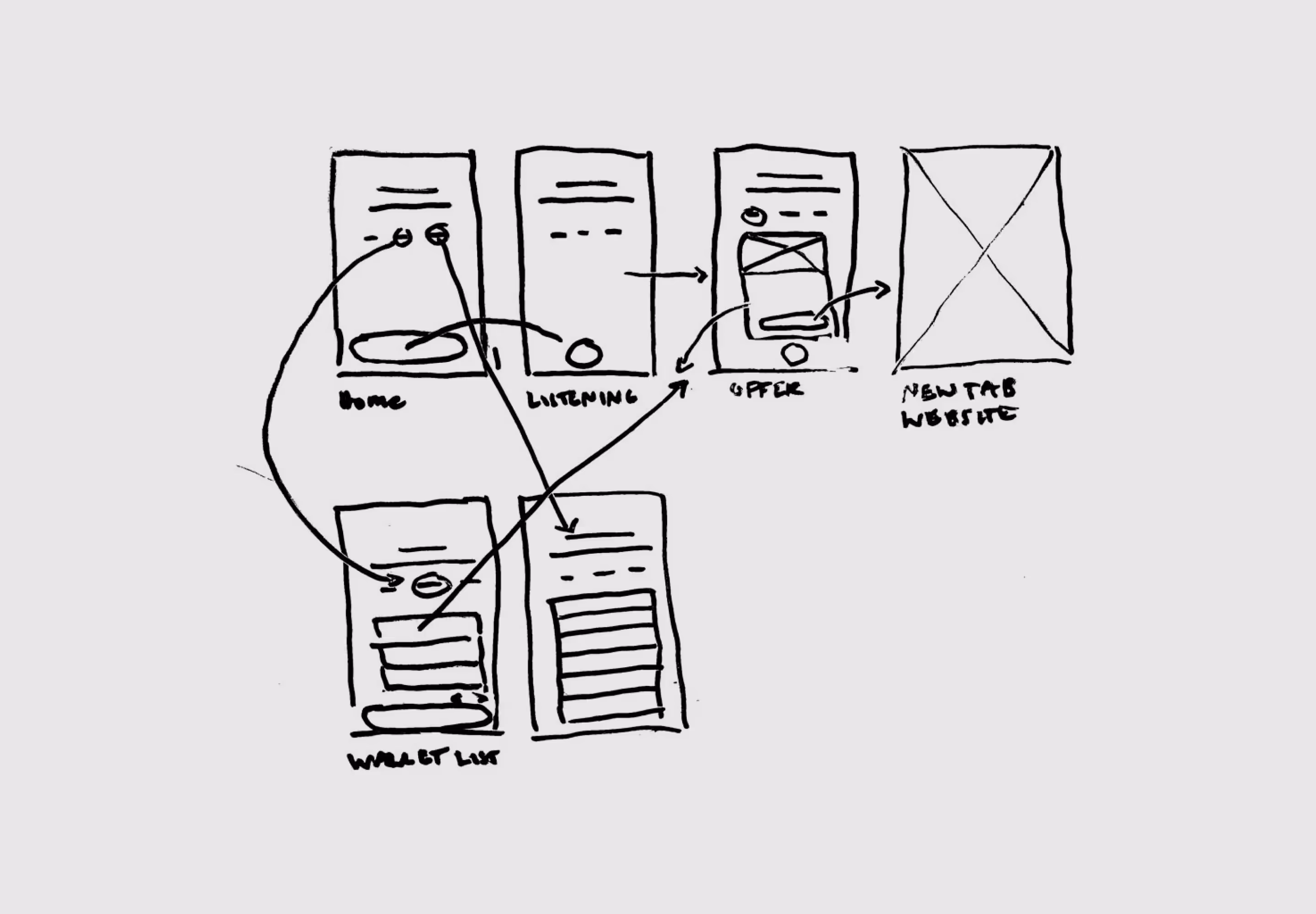
To address engagement, I explored a swipe-based card interaction inspired by familiar patterns from dating apps — creating a simple, intuitive way to evaluate and respond to content. User actions informed preference building, allowing partnership offers to be filtered into a progressively more relevant stream over time. While the ideal swiping interaction wasn’t fully realized, the final solution achieved a balanced and effective compromise.
- Familiar interaction model: Swipe-based cards leverage known patterns to reduce learning curve and increase engagement
- Progressive personalization: User actions build preferences, shaping a more relevant content stream over time
- Practical execution: Delivered a balanced interaction that maintained intent while aligning with technical constraints
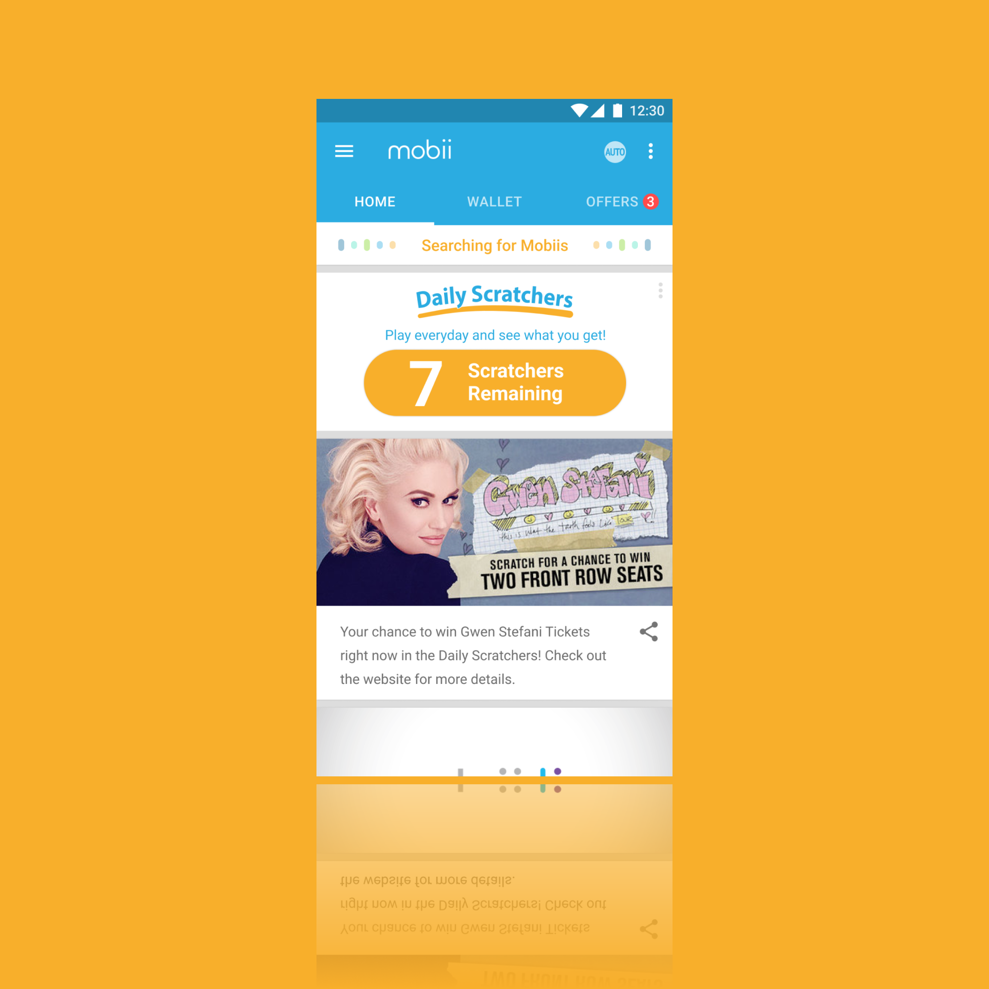
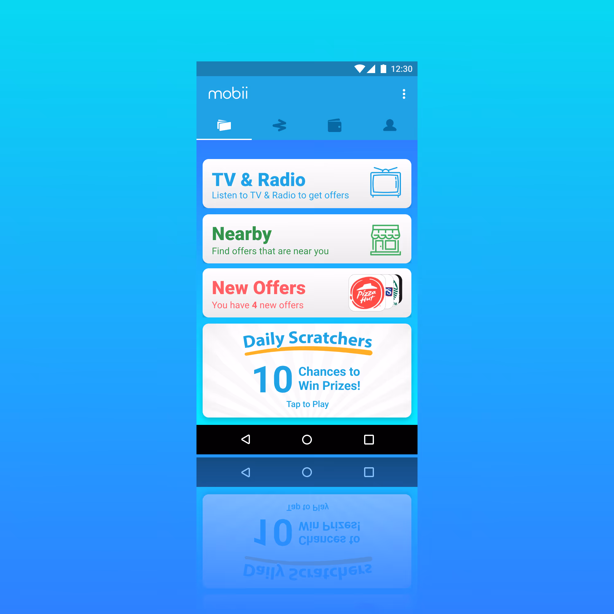
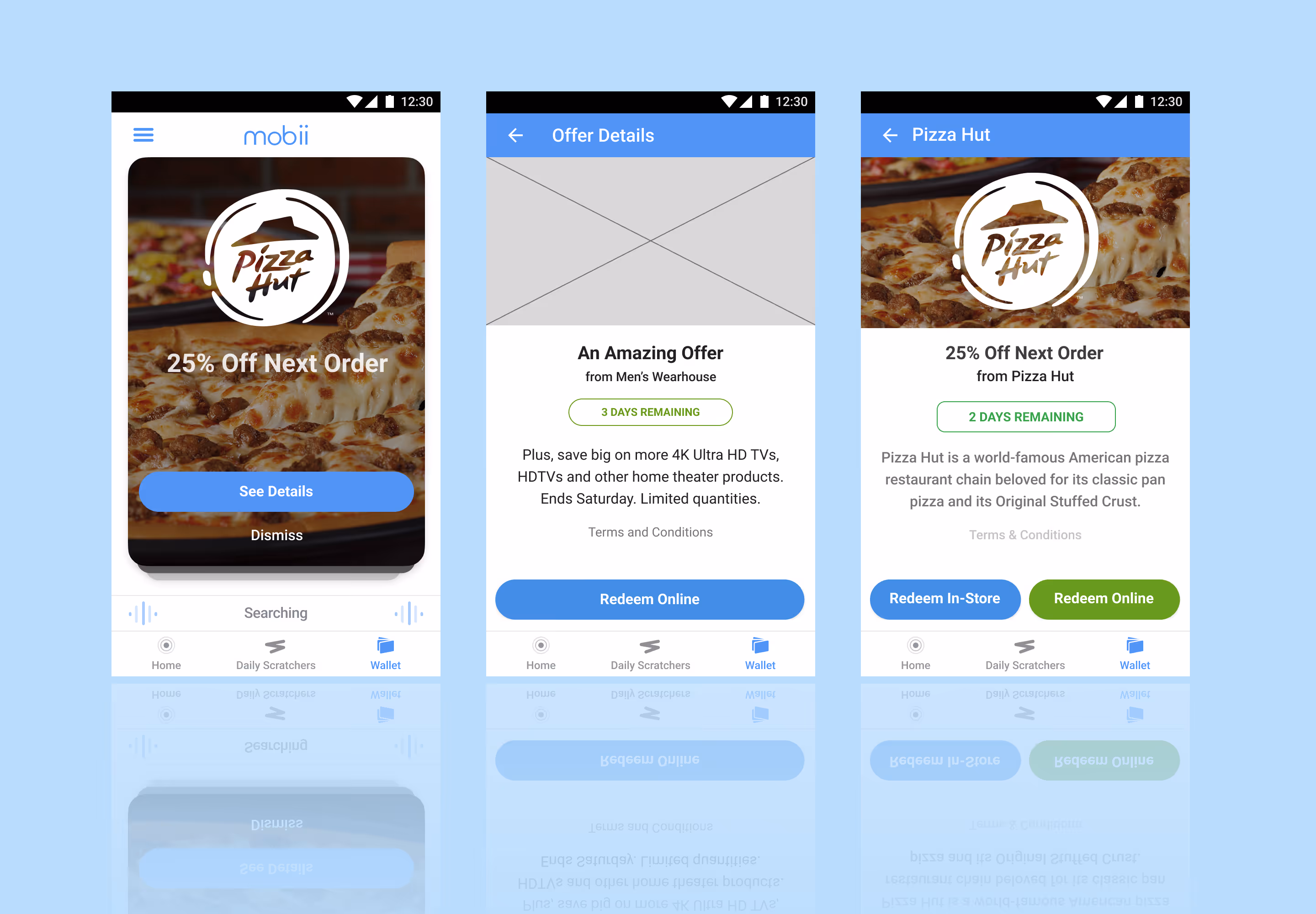
Story Card Feature
Relevant Flexible Content
I designed a story card feature to replace the filtered content feed. These cards could be manipulated in the dashboard through a new Story Card View. This allowed for the content and design teams to create content in support of user interaction through micro-sites or in support of campaign from partnerships. I designed one for each type of available interaction —— static, content with details, and linked content.
- Immediate campaign support: Delivered relevant, actionable content in real time
- Sustained content pipeline: Provided ongoing assets to pair with microsites
- Increased campaign visibility: Extended exposure for upcoming initiatives
- Cohesive cross-channel experience: Aligned seamlessly with social team efforts
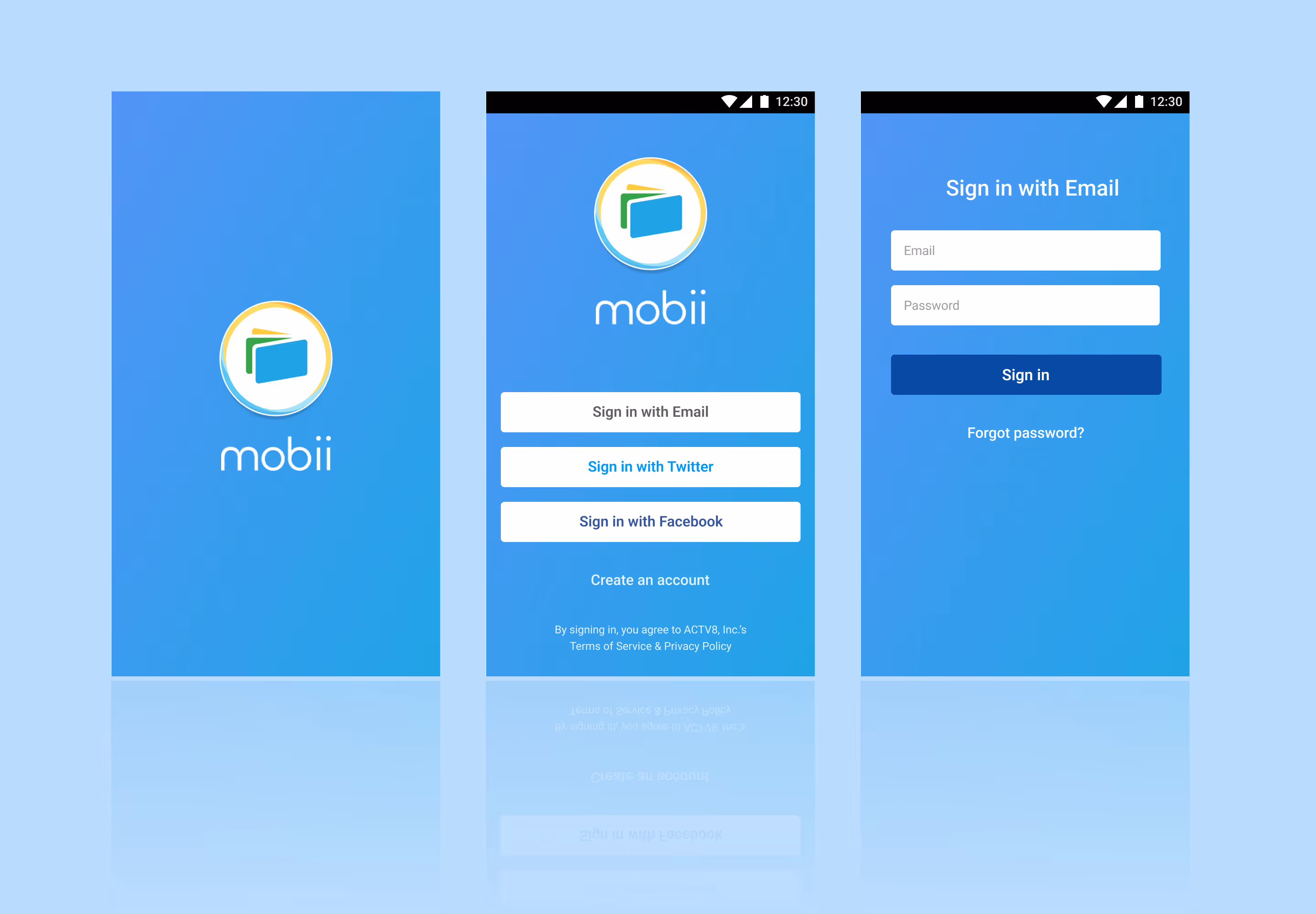
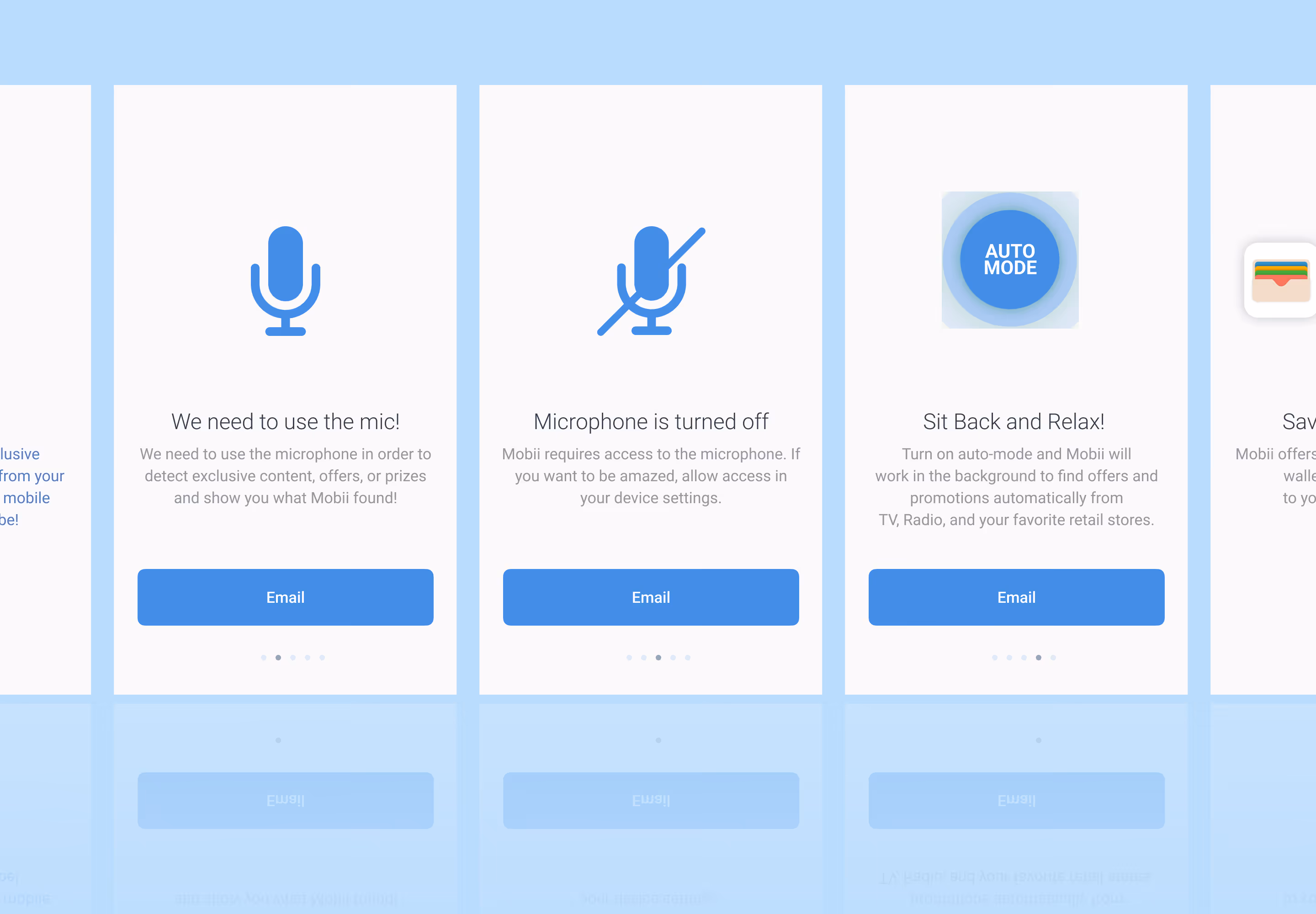
Simple Visual Language
Simplified Content Direction
I developed a visual language which emphasized simplicity. Using Sketch I built out a basic template set so that the team could stay relatively cohesive. I had three core objectives for this direction:
- Simplified experience: Designed for easy consumption to address low user interaction
- Shared creative workflow: Unified team collaboration through Sketch
- Structured asset control: Managed versioning and consistency via Abstract

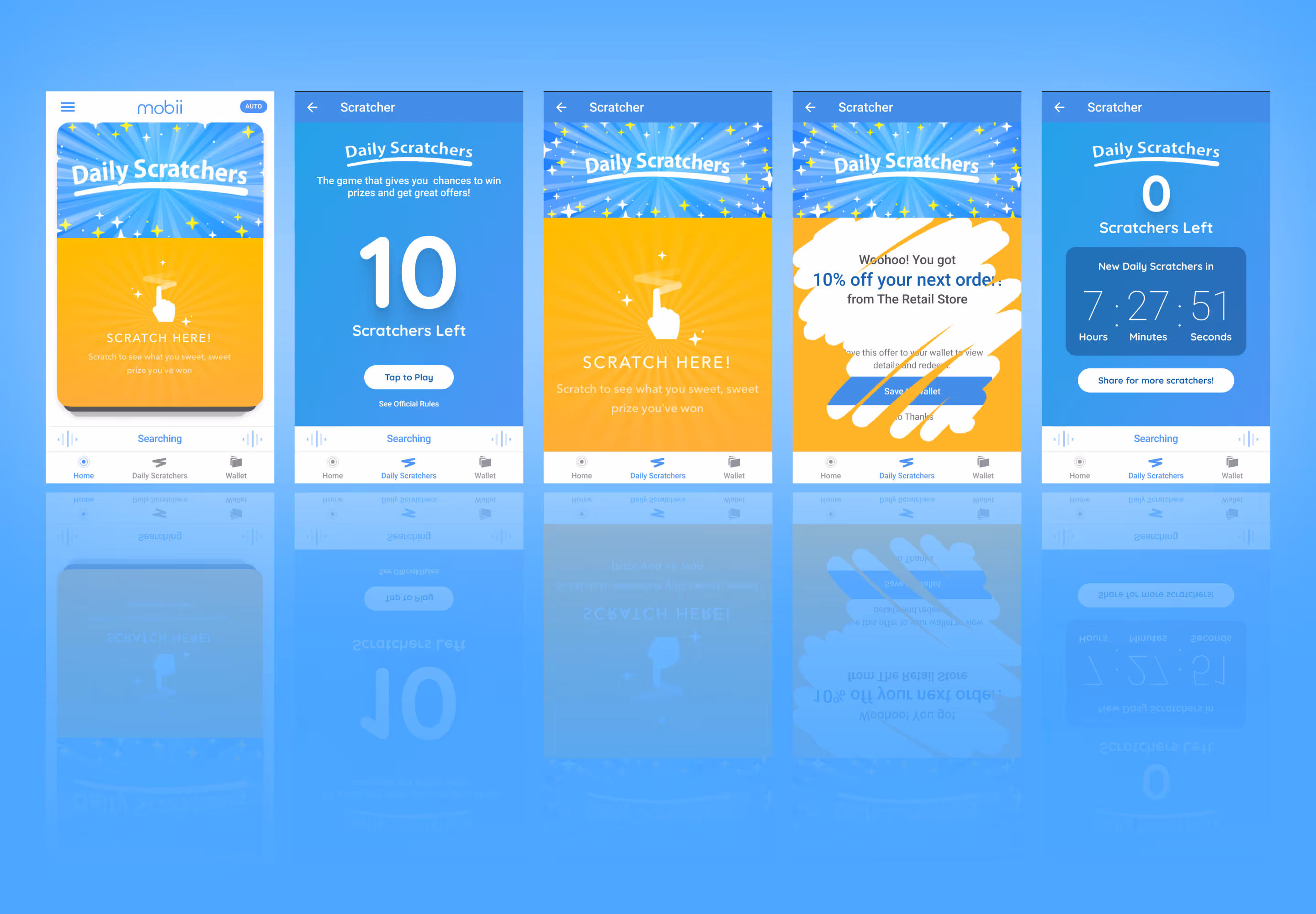
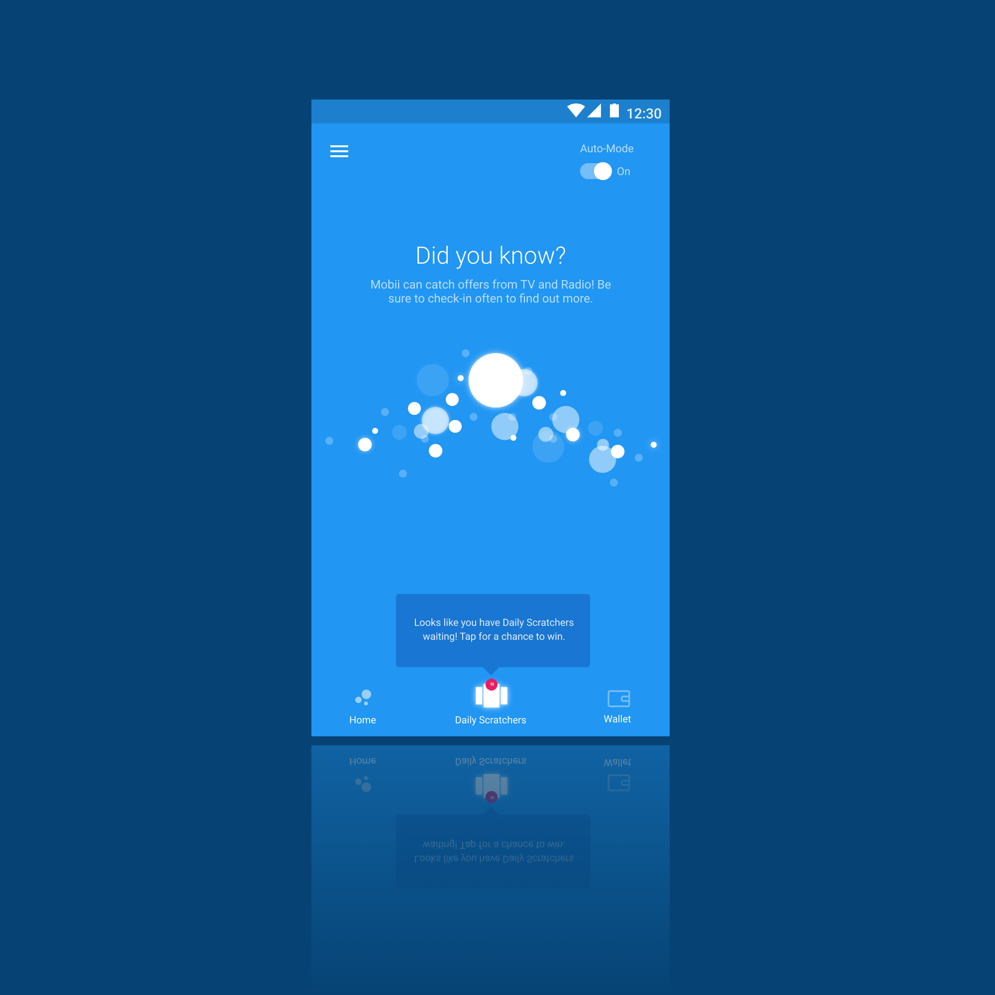
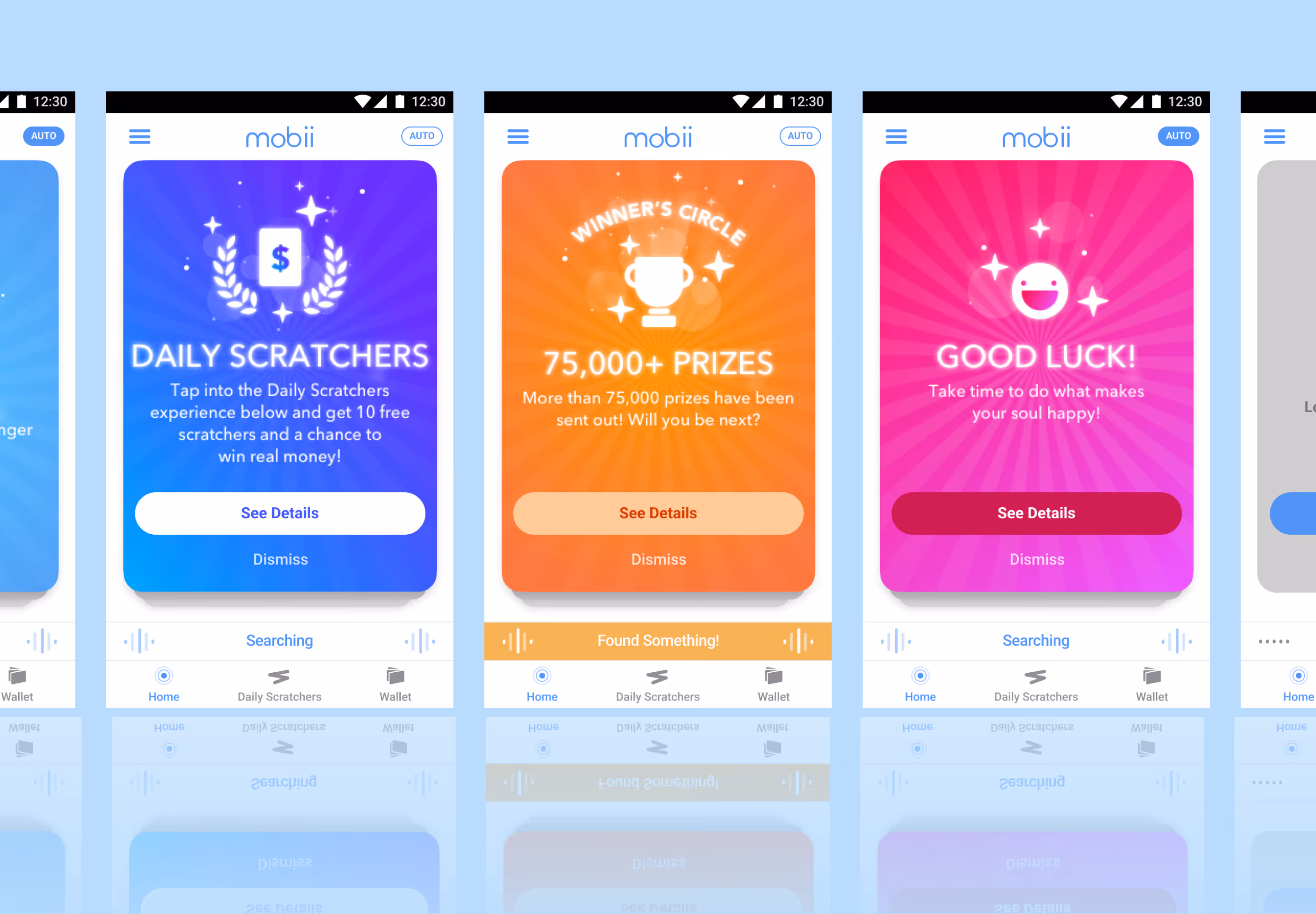
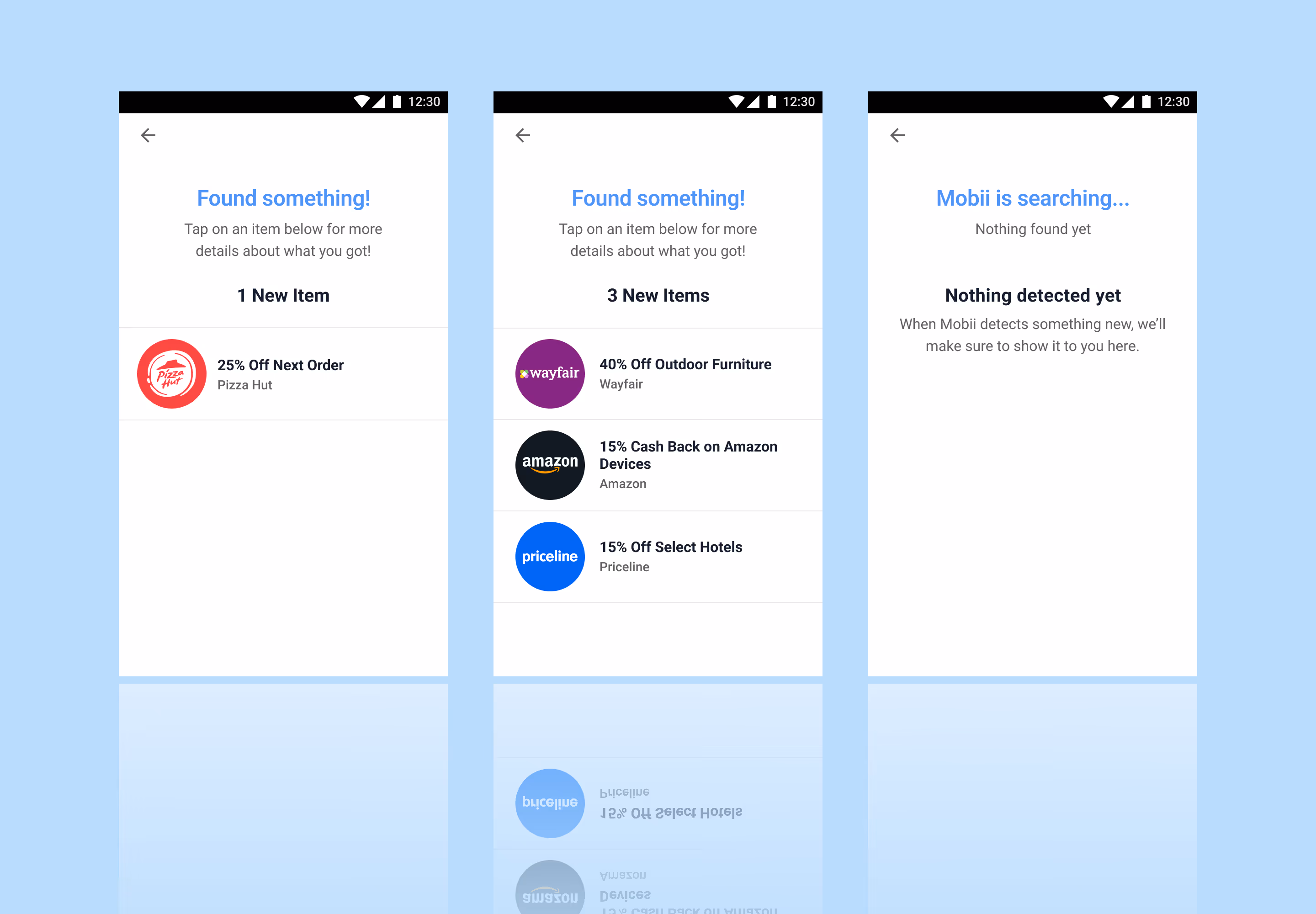
Detection Drawer View
Persistent Collection
Being that low content engagement was the primary issue, I designed a detection drawer view that would bring content directly to the user.
- Reduced friction discovery: Content surfaces directly within the interface, minimizing effort and increasing engagement
- Expanded, low-pressure collecting: Continuous collection groups present more options without overwhelming the user
- Contextual relevance: Drawer delivers timely, targeted content aligned with user behavior and intent
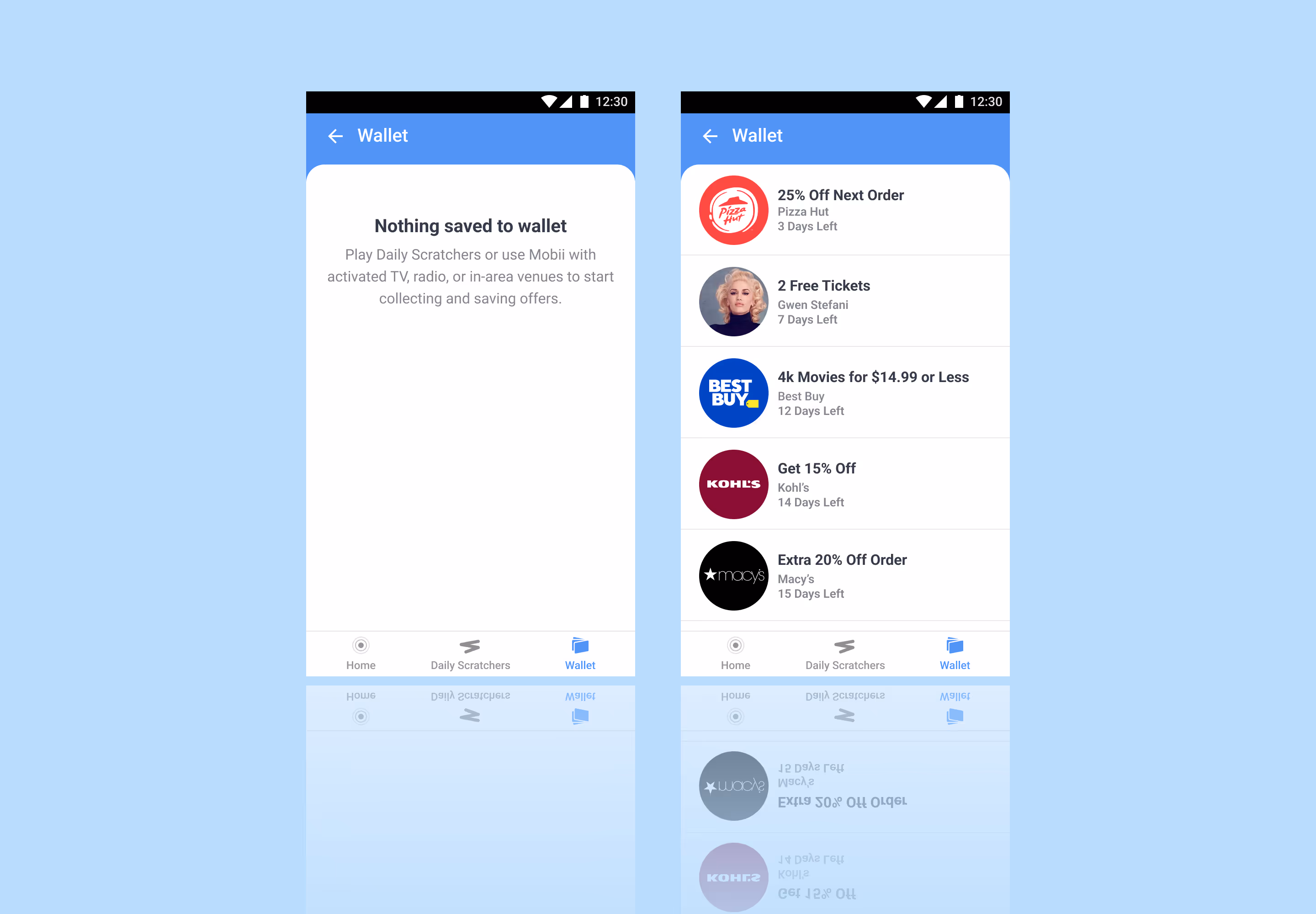
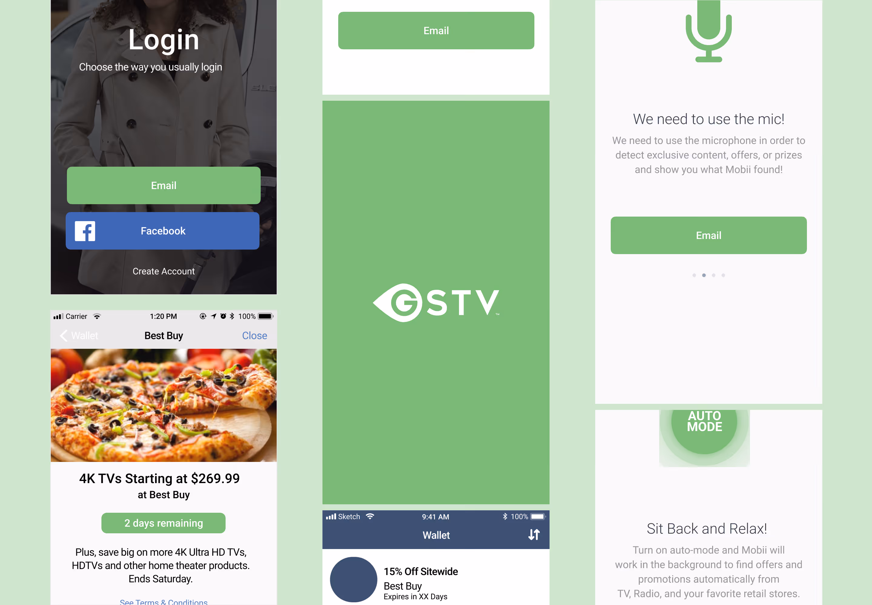
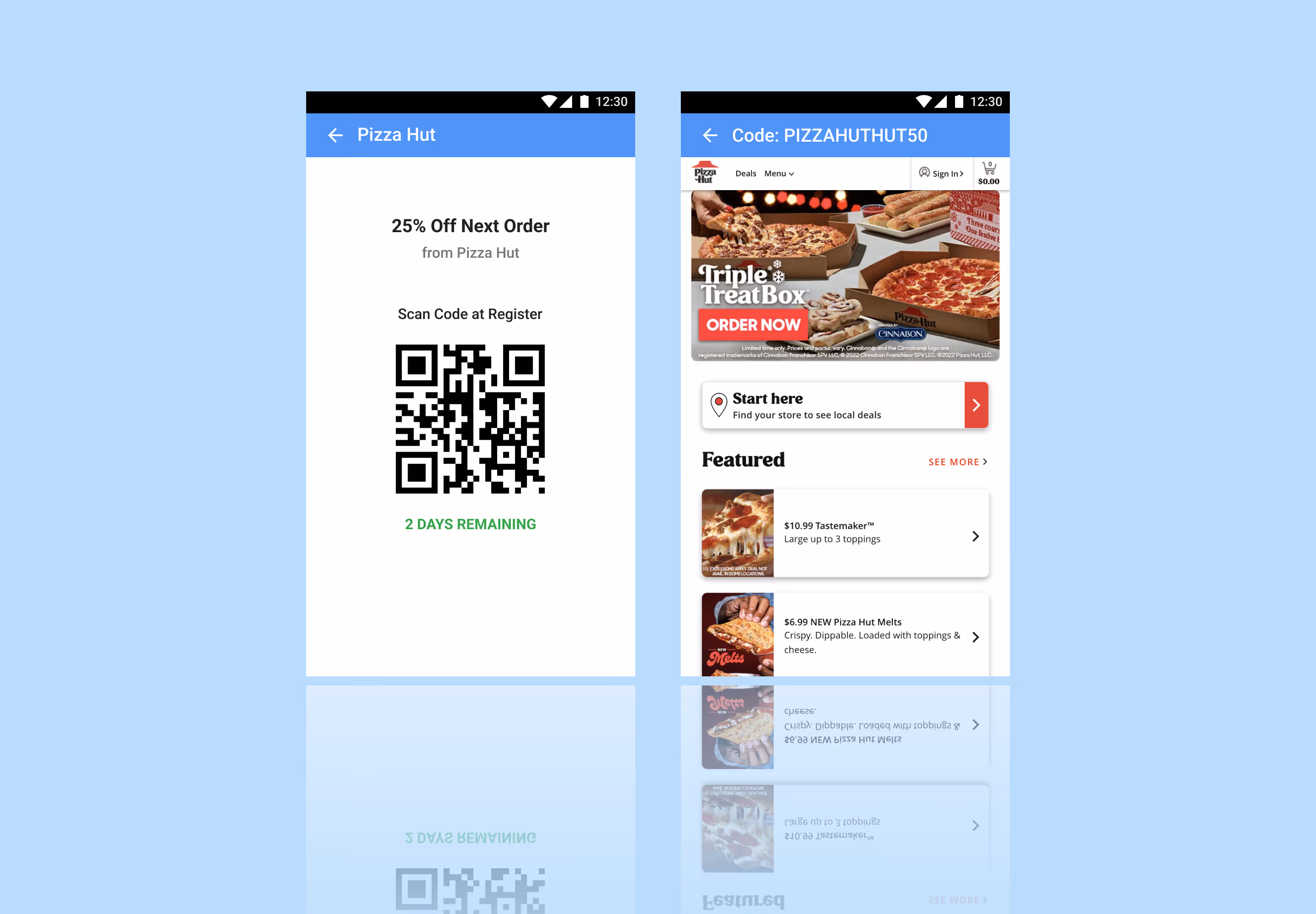
Redemption Views
Redemption
To streamline the final step of the experience, I designed flexible redemption views that clearly present either an in-store code or an online attached offer code, ensuring users can act immediately with confidence.
- Clear action pathways: Distinct in-store and online states remove ambiguity and guide users to the correct redemption method
- Immediate usability: Prominent, ready-to-use codes reduce friction at the moment of conversion
- Context-aware presentation: View adapts based on offer type, ensuring relevance and clarity across redemption scenarios
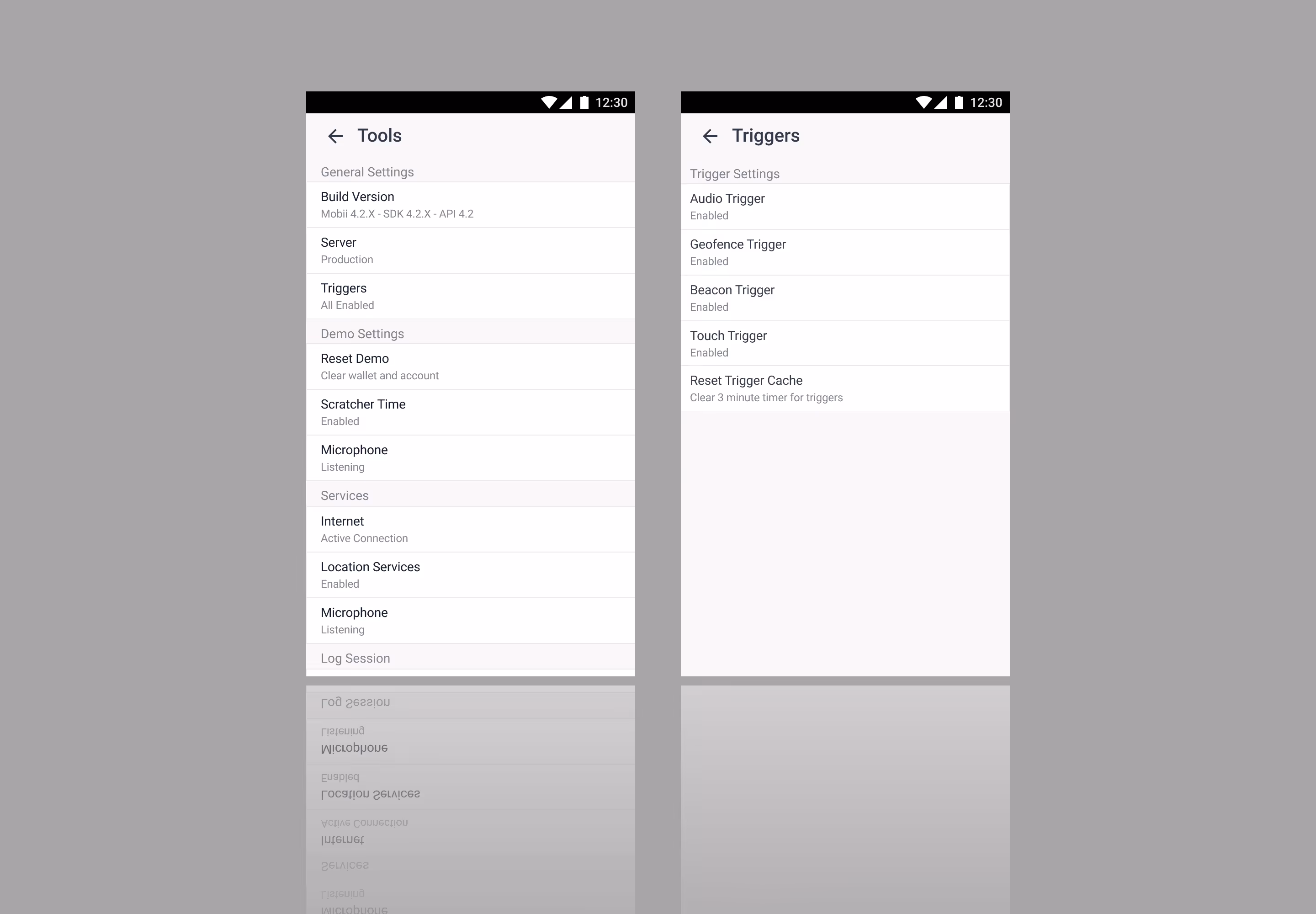
Quality Assurance View
Developer (QA) View
I designed a developer or quality assurance (QA) view to help with troubleshooting to help reduce the back-and-forth when working on updates.
- Aligned development handoff: Clear, accurate sharing of environments with developers
- Controlled feedback modes: Toggleable settings to scope and focus feedback
- Stronger cross-functional clarity: Improved alignment across business, product, and communication streams