
Designing a unified branded digital ecosystem.
I led the design and helped drive the implementation of a unified redesign across ACTV8me’s websites, internal and external dashboards, apps, and documentation platform improving consistency, usability, and overall brand cohesion.
Context
Challenge
Multiple digital surfaces needed one cohesive system.
ACTV8me’s ecosystem included a corporate website, internal dashboard, and documentation platform. Each served different audiences, but lacked a unified visual and structural language. The goal was to improve consistency, usability, and scalability across every touchpoint.
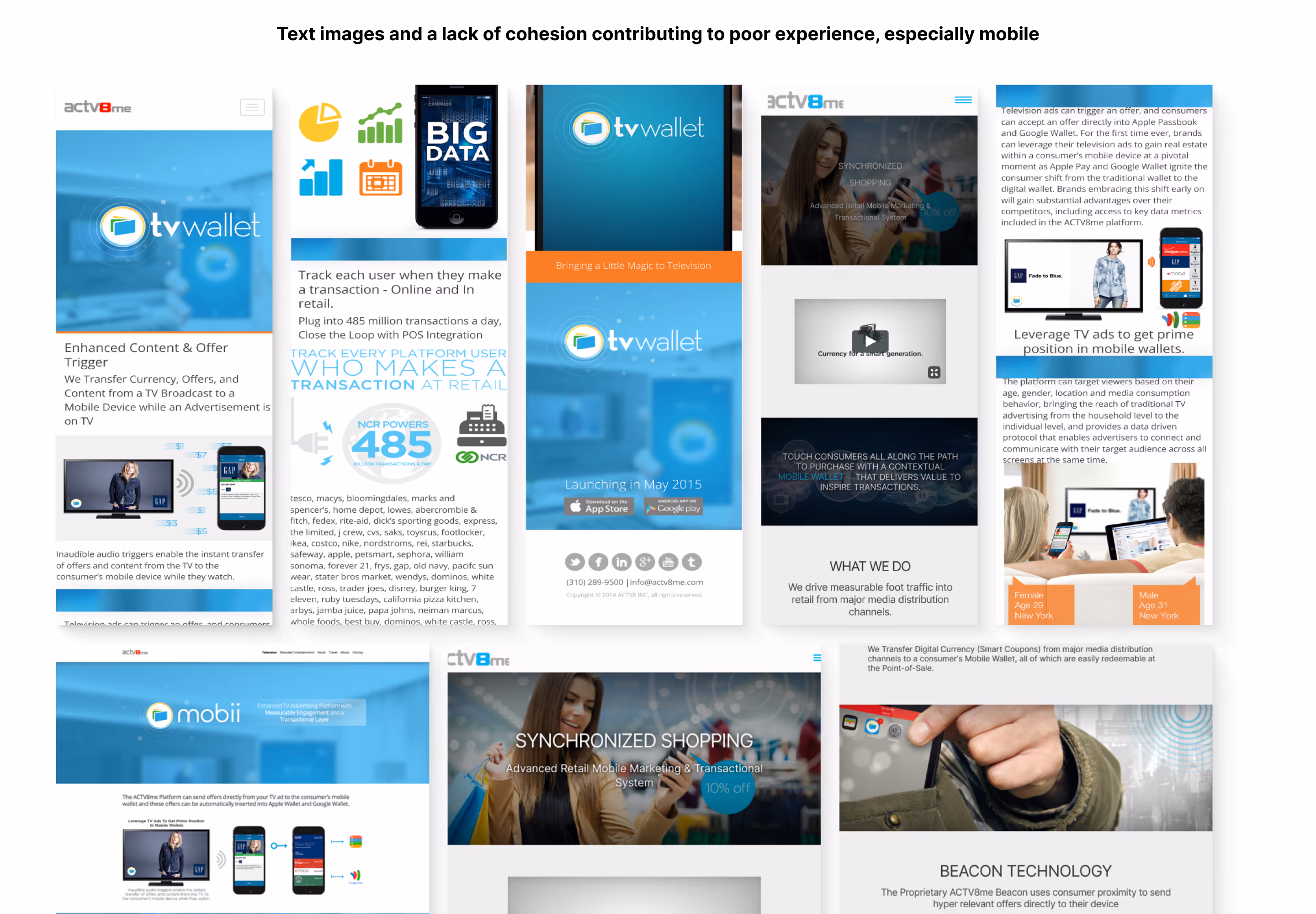
Prior to the redesign, large images were used instead of broken up. Although effective and clear, they resulted in chaotic styling. Typograhy and colors weren't code and were very difficult to control effectively as they were large images. Small screen sizes were severely affected.
Approach
Strategy
Build agile shared foundations with Foundation and Sketch ready to pivot.
I approached the project through systems thinking and real knowldege of what was happening with the company and product. I started with a fresh Foundation project and small but organized style guide in Sketch. I then defined a prudent core set of components, designed and developed the client-facing website, and built experience wrappers for content pages used by the apps that allowed for experimentation with a standardized interface that felt seamless. This created a flexible and stable framework that could scale and afforded the capability to explore and push experiences.
Key items:
- Refresh with a lean and understandable structure using the Foundation framework
- Scaffold dynamic web wrappers for app experiences
- Use variables and partials to help maintain consistency
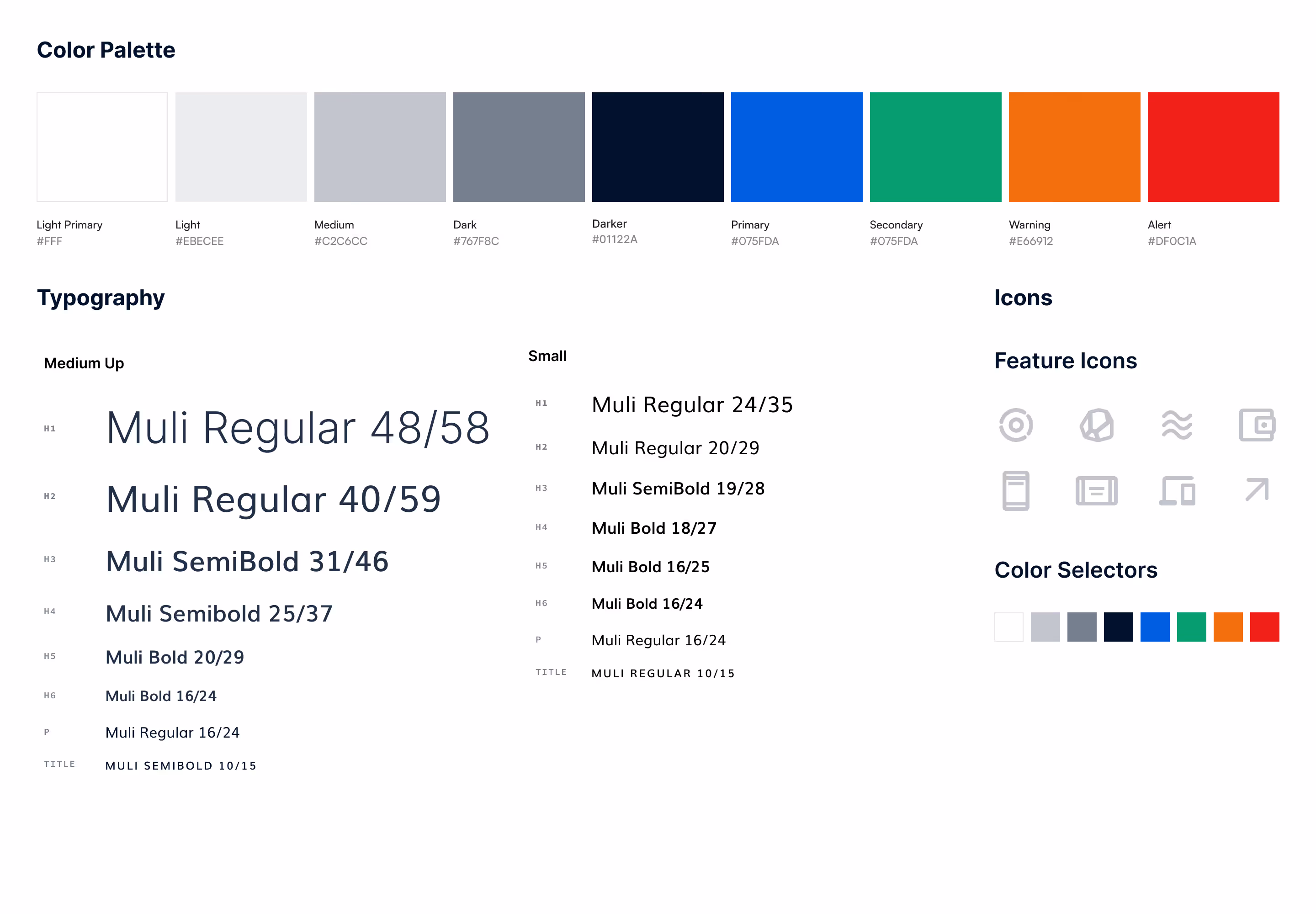
This design kit provided the fundamental visual elements and went a very long way. Prior to these definitions, I was often asked about fonts, colors, and iconography —— so much so I used to joke about getting a tattoo of the primary blue hexidecimal code on my left forearm.
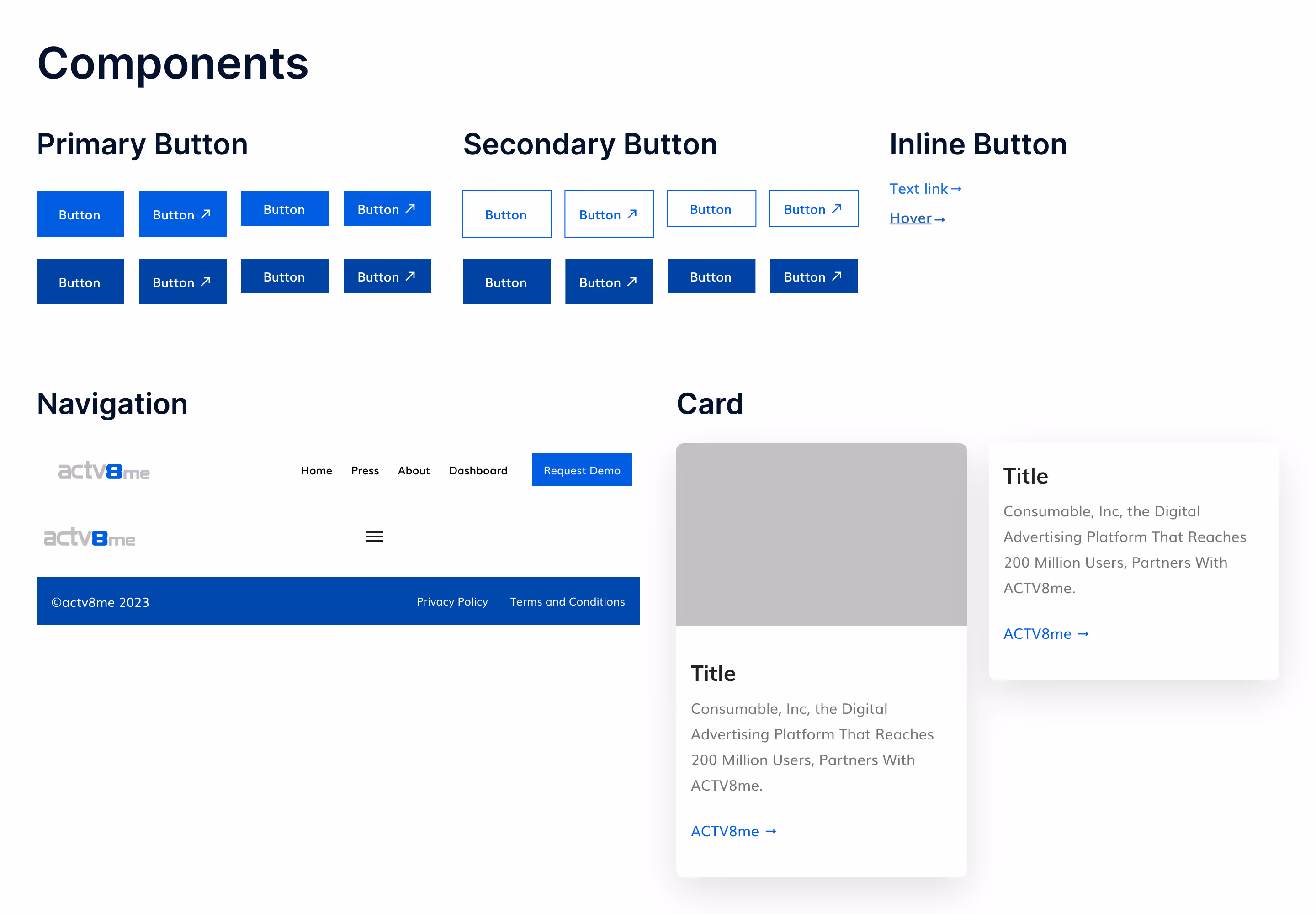
Foundation
Design System
Components were designed for designer speed, consistency, and flexibility.
The system included core interface elements such as buttons, cards, navigation patterns, basic states, and responsive behavior direction when needed. By standardizing common patterns, new experiences could be designed and implemented faster with stronger visual consistency. I managed it with Abstract (versioning), Sketch, and InVision Design System Manager and executed in Foundation and React (later experience pages).
This before and after illustrates my attempt to add a sense of abstraction. I wanted less literal, more emotional, a sensation of what this technology does: activating the world. Invisible waves become transmission vehicles. The challenge for communicating this product's capabilities at a high level is that it functionally did so much —— the concept is activation of space and time through the user's device.
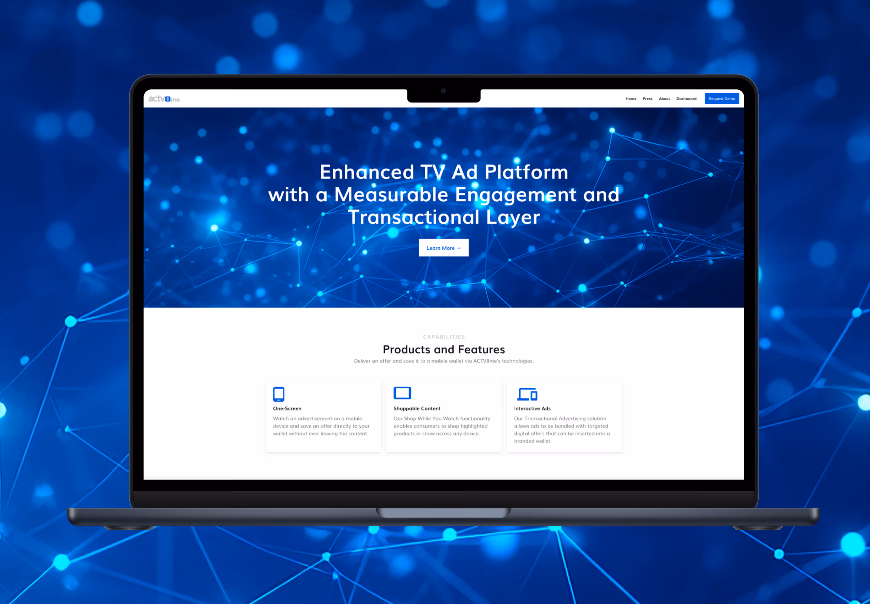
External Experience
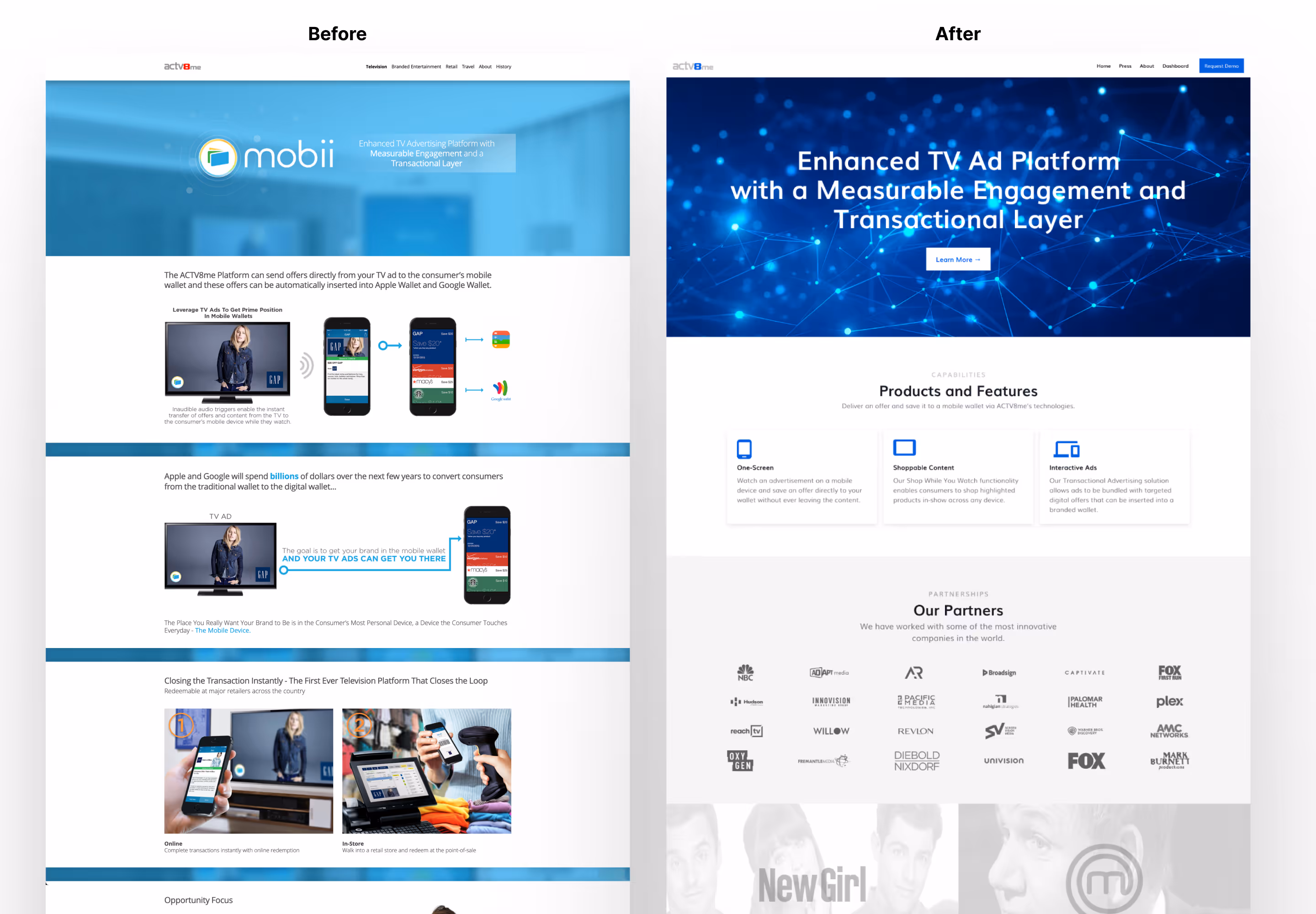
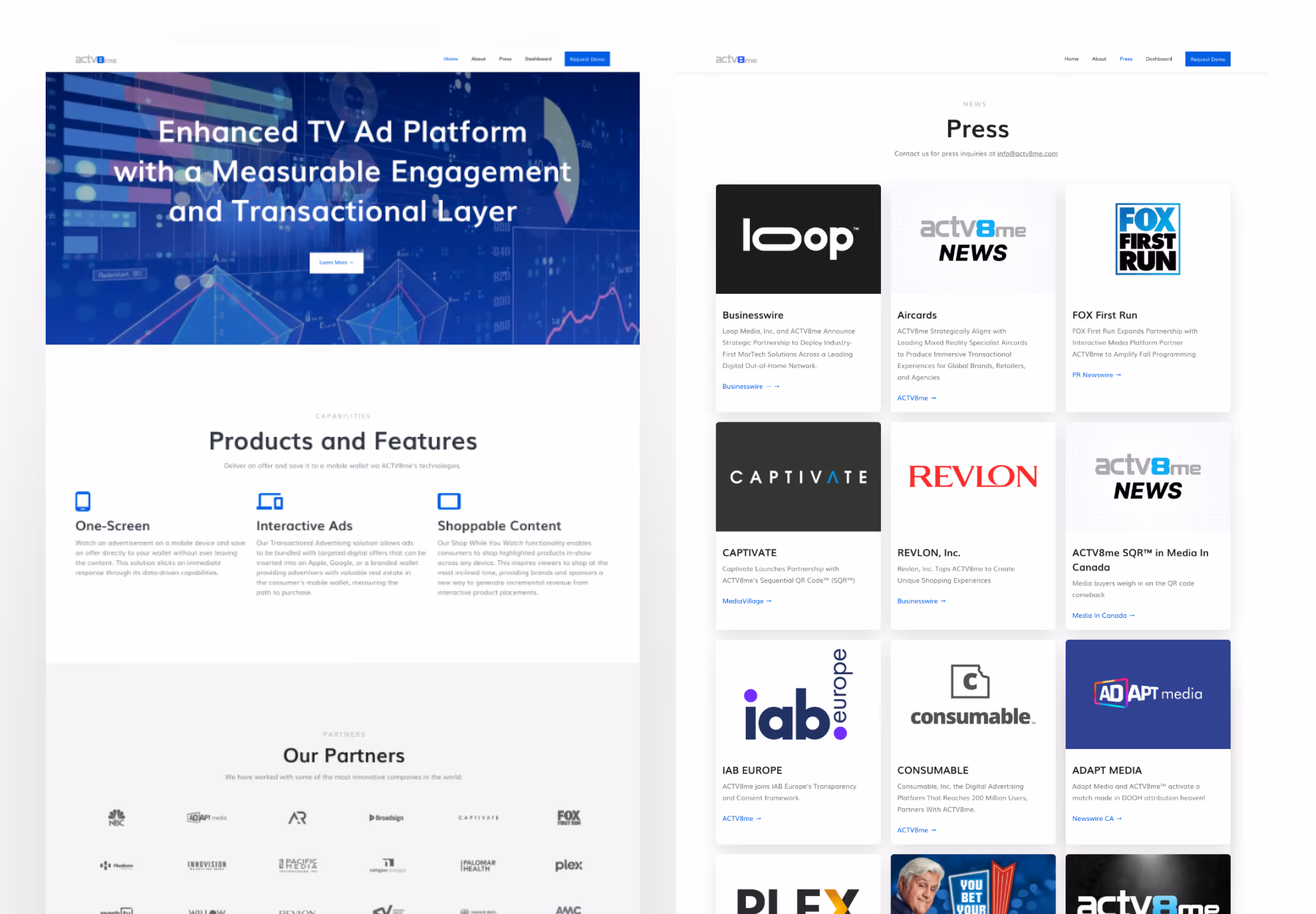
Before / After Website
A stronger external presence built on clarity and trust.
The marketing website was refined to better communicate the platform, improve content hierarchy, and create a more modern brand impression. Messaging pathways and calls to action became clearer and more intentional. Although not all my initial ideas didn't make it through, the collaboration still resulted in a strong update.
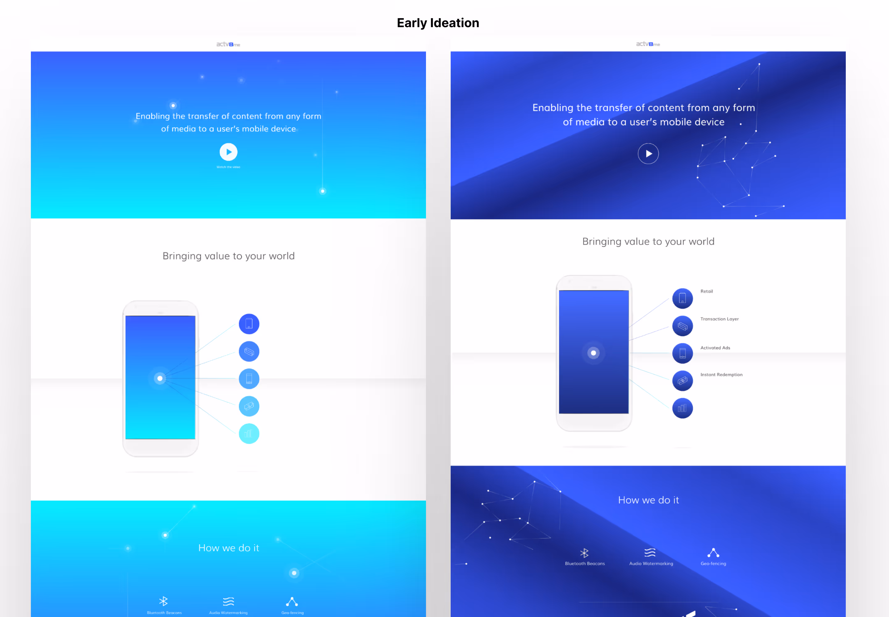
These spacy ideas didn't make it far, but they show my process starting with an intentional elegance, ethereal — like the listening technology of the product itself. A living, activated space in time searching through attributes.


I used the Foundation framework (Bootstrap alternative) and partials (components) to create manageable repeatable patterns. The previous site used static global elements (common in the days the site was created) such as top bars which required a significant effort to update —— even on a relatively small site.
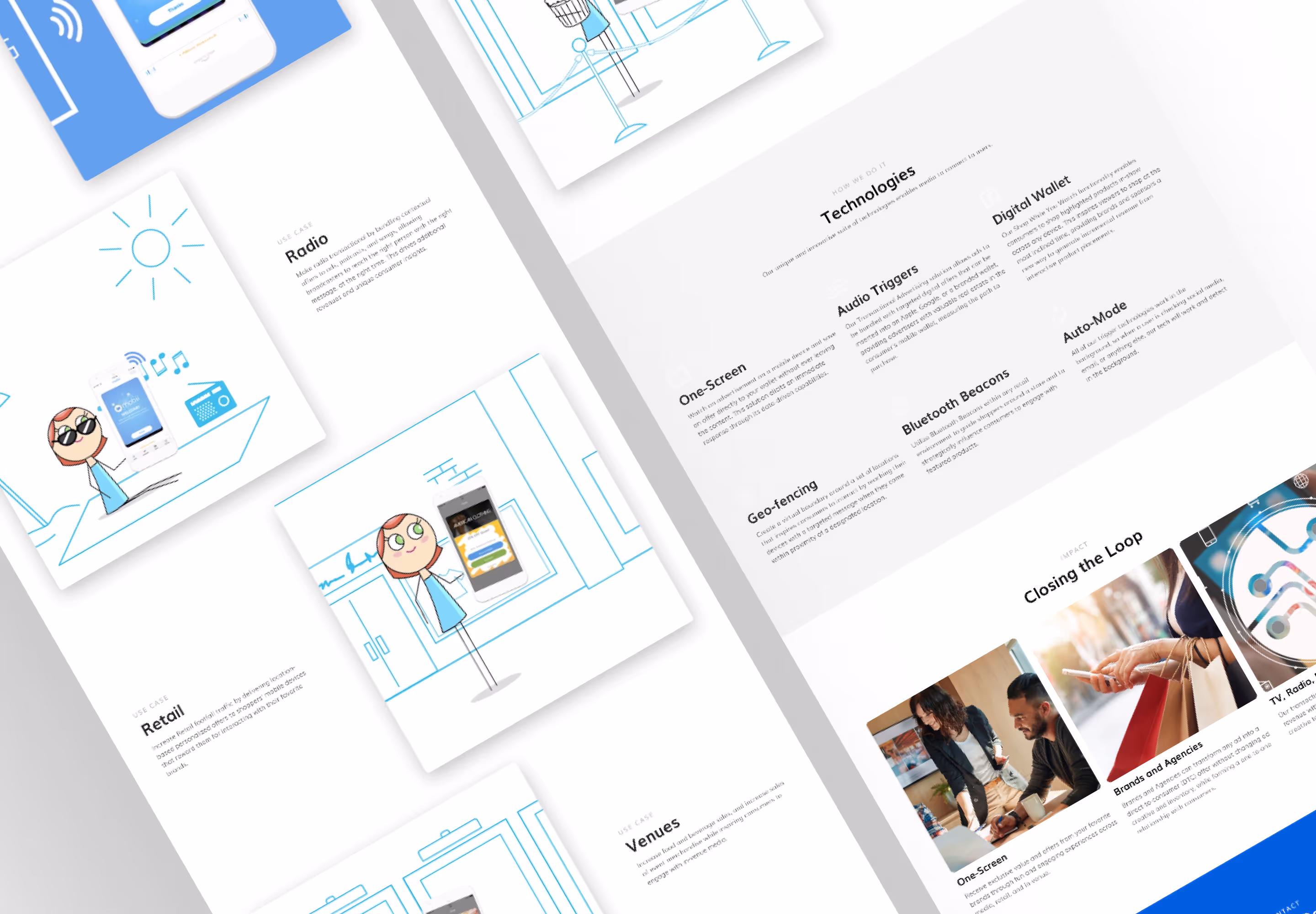
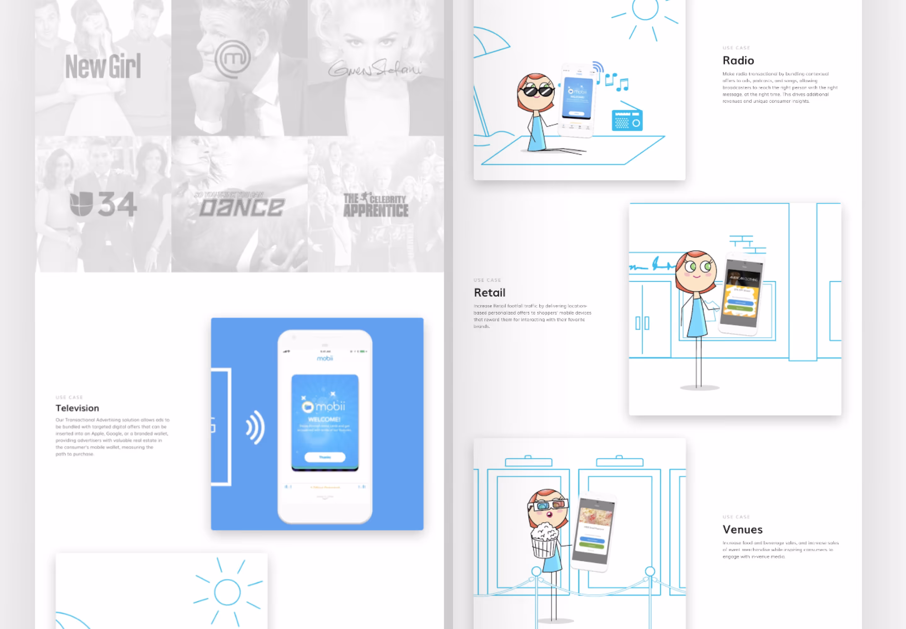
The great cartoonish illustrative videos were by my talented creative director for videos the team used to help partners understand the technology. I included them in my web design to help tell the story of use cases for the product.
Product Experience
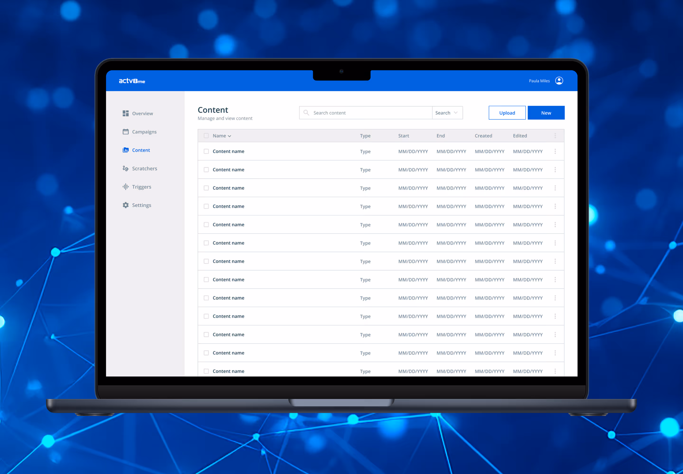
Dashboard
A content creator that deployed, tracked, and presented performance.
The internal dashboard applied the system to high-utility workflows where clarity mattered most. Navigation, information density, and interface consistency were improved to support everyday use and future expansion.
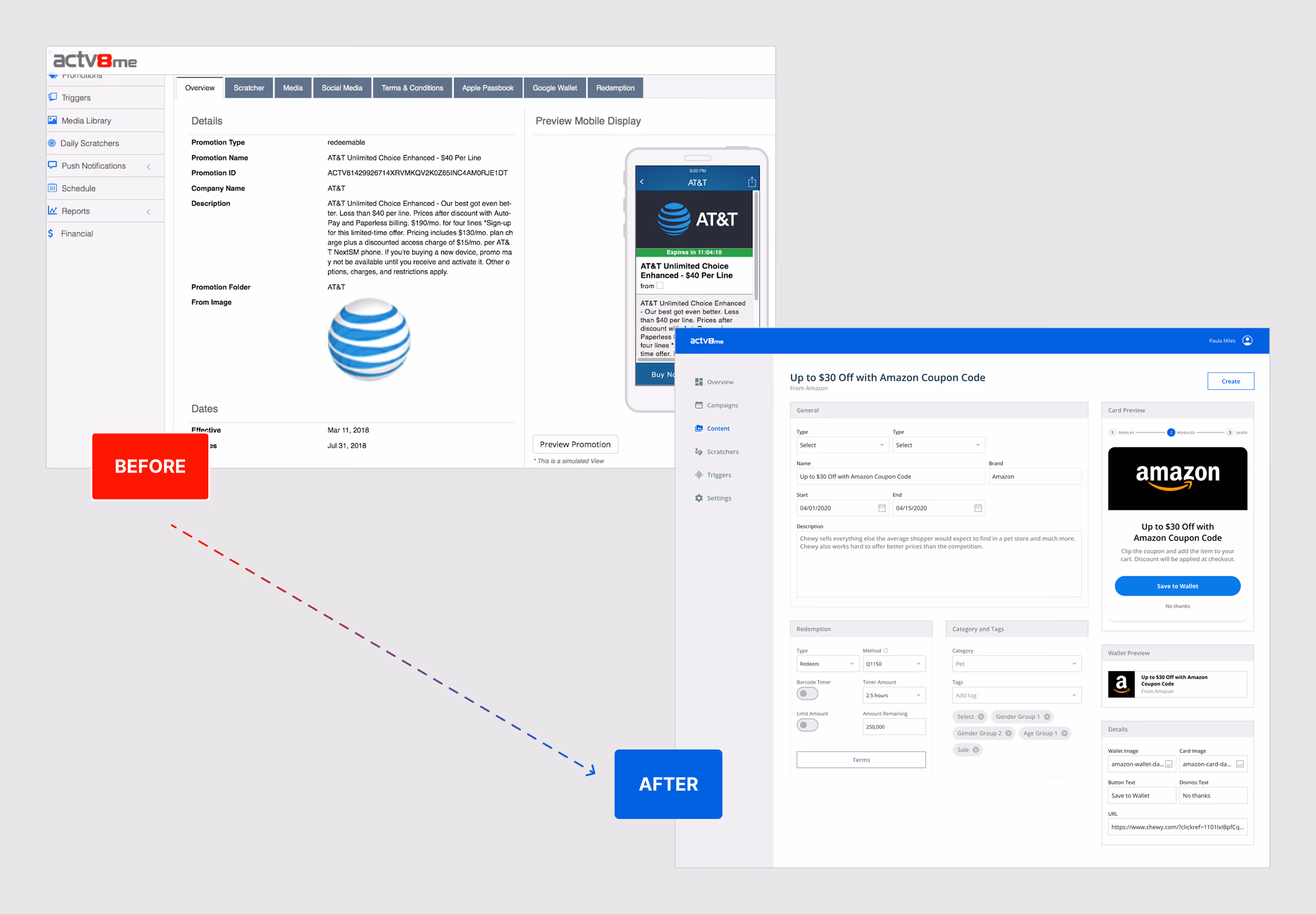
Transformation
Before and After
A fragmented workflow became a more cohesive and scalable product experience.
The redesign brought clearer structure, stronger consistency, and more intentional user flows across the dashboard. What had previously felt disconnected became a more polished system designed to support everyday use and future growth.
Experience Design
Userflows
Core workflows were simplified to reduce friction and improve task completion.
I mapped and refined key dashboard journeys to help users move through content creation, management, and updates more efficiently. Clearer navigation, better decision points, and consistent interface patterns created a smoother experience across recurring tasks.

Management
Content List
Published and draft content became easier to scan and manage.
List views were structured for readability, faster sorting, and clearer status recognition. This helped users quickly locate items and manage growing content libraries efficiently. This content could be surfaced to users through the Mobii app (and partner apps) that I redesigned.

Experience
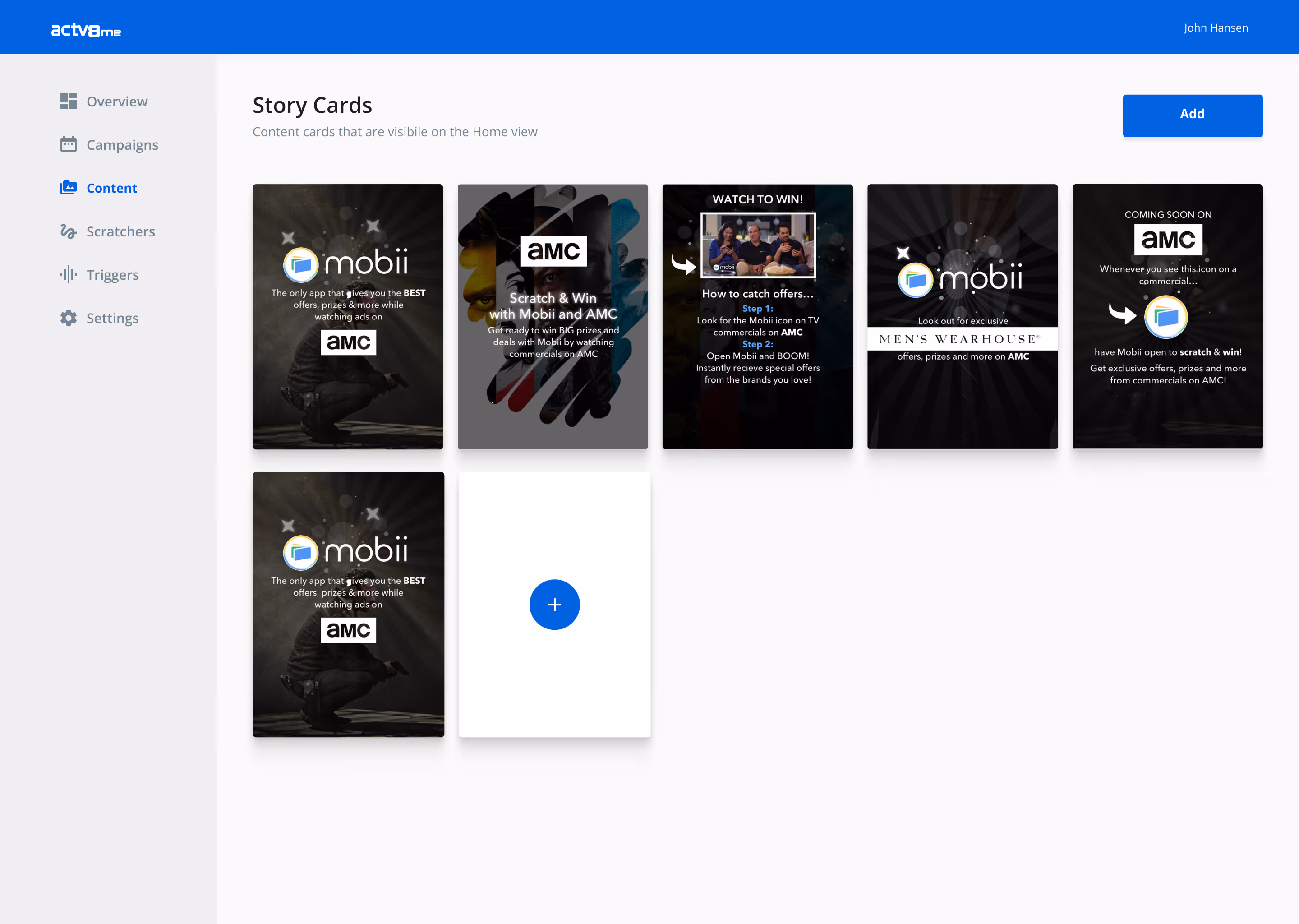
Story Cards
The content team could create content cards that would appear on the app.
Content cards could be used to help the user when the first enter the main app experience. They could be of different types. The user of the dashboard could create informative or action cards. Informative cards provide static information and media flexibility where action cards had a section devoted to user calls-to-action that could dynamicall direction.
Platform Control
Daily Scratcher Management
A dedicated control center simplified scheduling and content management.
I designed the Daily Scratcher dashboard experience used to manage content sets, scheduling, analytics visibility, and reward placements for the Mobii app. The interface helped streamline recurring feature operations while making updates faster and easier to control.

Platform Control
Settings
Administrative controls organized into a clearer and more scalable management hub.
I designed the settings experience to centralize platform configuration across clients, retailers, brands, regions, categories, tags, and delivery presets. A card-based layout improved discoverability, reduced friction, and made complex administrative tasks easier to manage as the platform expanded.

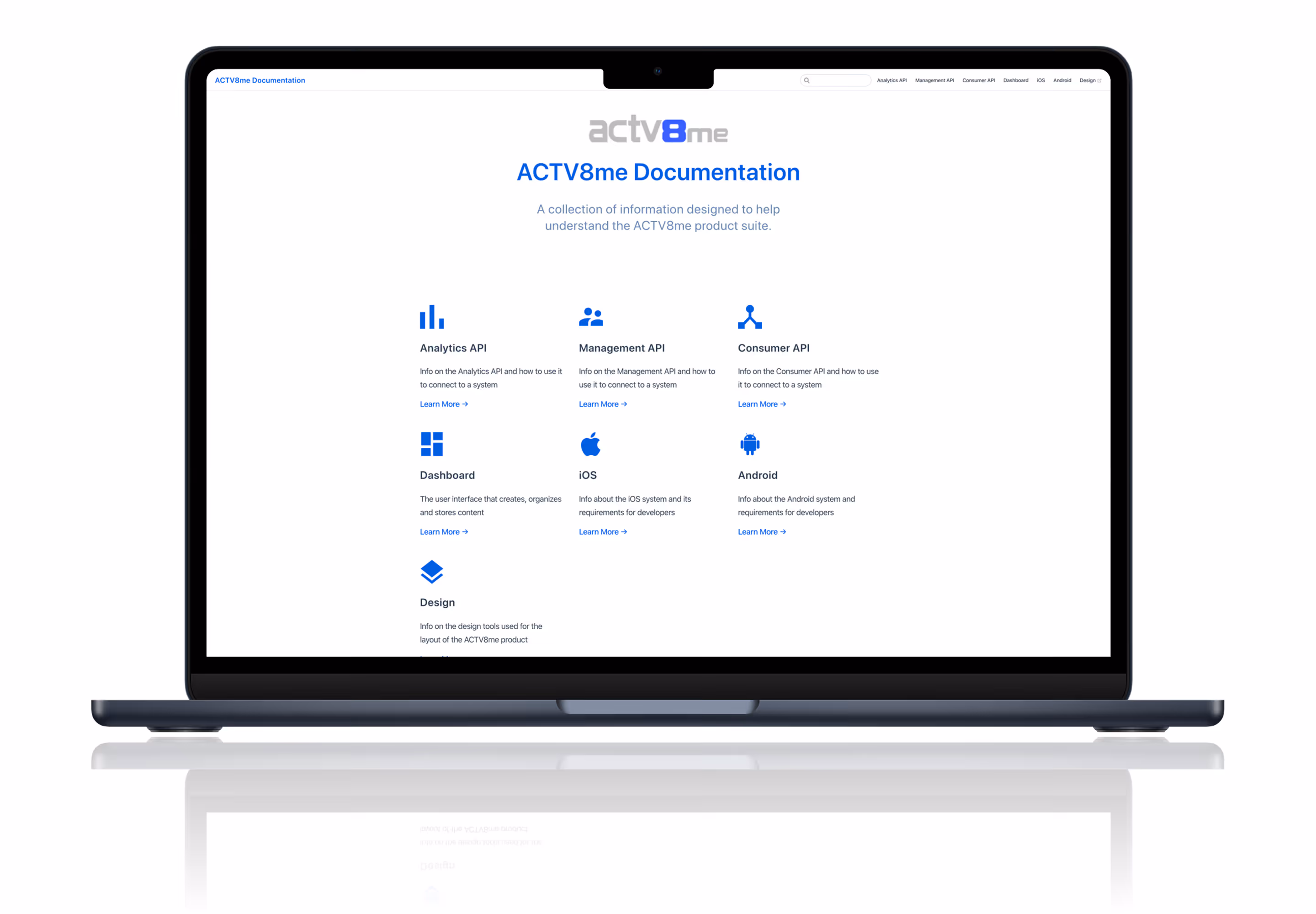
Documentation Experience
Documentation Platform
Documentation scaled through Markdown publishing.
I designed and built the documentation platform using the design system and a VuePress foundation. Teams could publish and update content through Markdown files managed through GitHub pushes, creating a faster and more maintainable workflow. Coupled with the previous documentation site that I maintained for developers, we had a well-rounded set of documentation that would help partner content teams, developers, and stakeholders.
Content Workflow
Markdown Contribution
Content updates became faster through Markdown-based publishing.
The platform allowed contributors to create and edit documentation using Markdown files pushed through GitHub. This reduced publishing friction, simplified maintenance, and made ongoing updates more efficient.

Knowledge Experience
Documentation Results
Structured pages made technical information easier to navigate.
Documentation pages were designed and built through contributions with clear hierarchy, readable formatting, and reusable layouts that improved scanning, comprehension, and consistency across the knowledge base. The base styles that were applied were from the design I system I built which created a unified experience.

Reflection
Final Thoughts
Strong systems create better products, faster teams, and more cohesive brands.
These projects demonstrated how thoughtful design systems can extend far beyond interface consistency. By aligning product, marketing, and documentation experiences under one shared foundation, ACTV8me gained a stronger platform for growth, clearer user experiences, and more efficient execution across teams.
Contact Me
I build thoughtful digital experiences. If you’d like to work together, I’d be glad to connect.
Use my form, send me an email at hello@johnhansen.design or schedule a call.