Interaction Redesigned
Experience Direction
To address engagement, I explored a swipe-based card interaction inspired by familiar patterns from dating apps — creating a simple, intuitive way to evaluate and respond to content. User actions informed preference building, allowing partnership offers to be filtered into a progressively more relevant stream over time. While the ideal swiping interaction wasn’t fully realized, the final solution achieved a balanced and effective compromise.
- Familiar interaction model: Swipe-based cards leverage known patterns to reduce learning curve and increase engagement
- Progressive personalization: User actions build preferences, shaping a more relevant content stream over time
- Practical execution: Delivered a balanced interaction that maintained intent while aligning with technical constraints
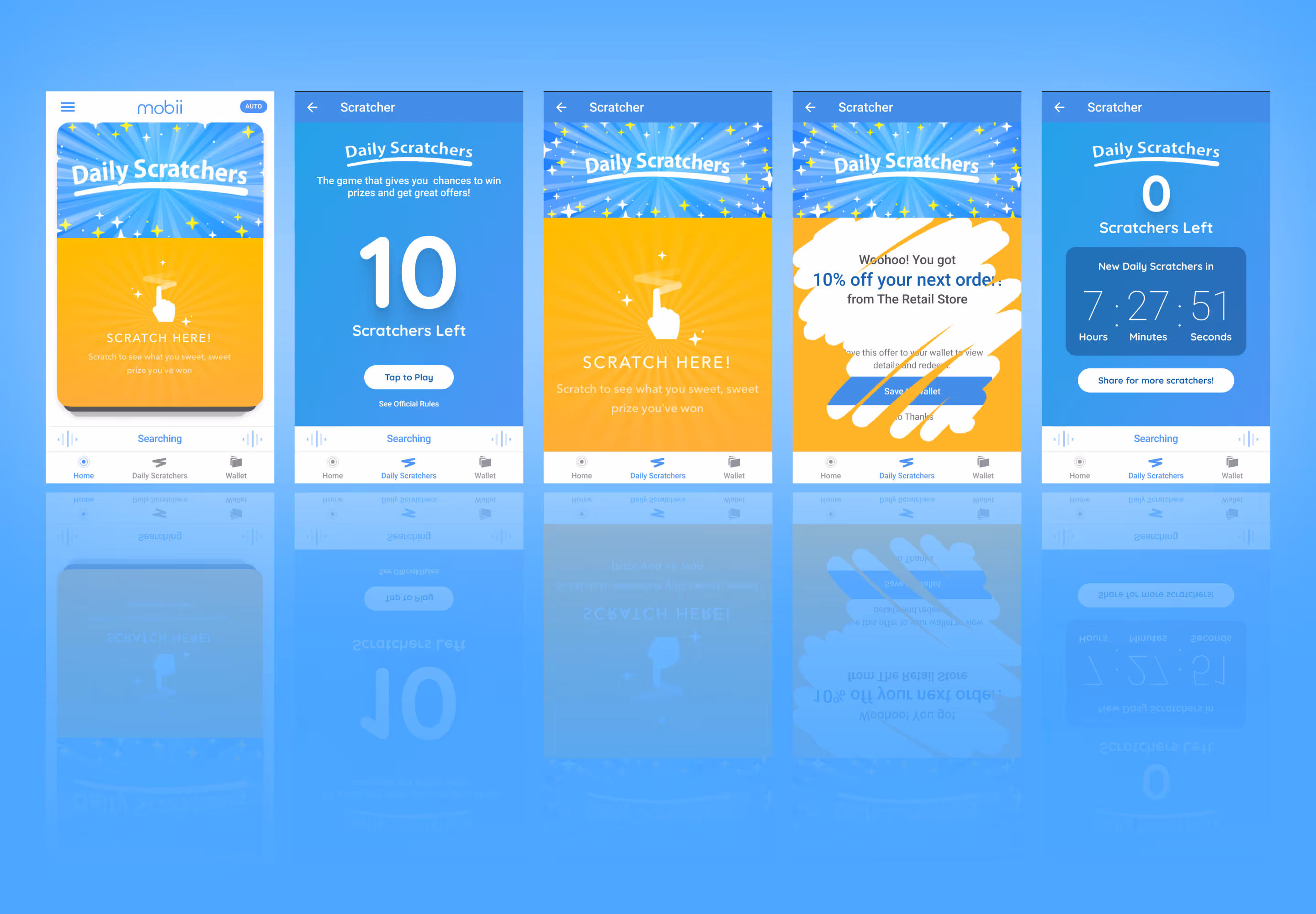
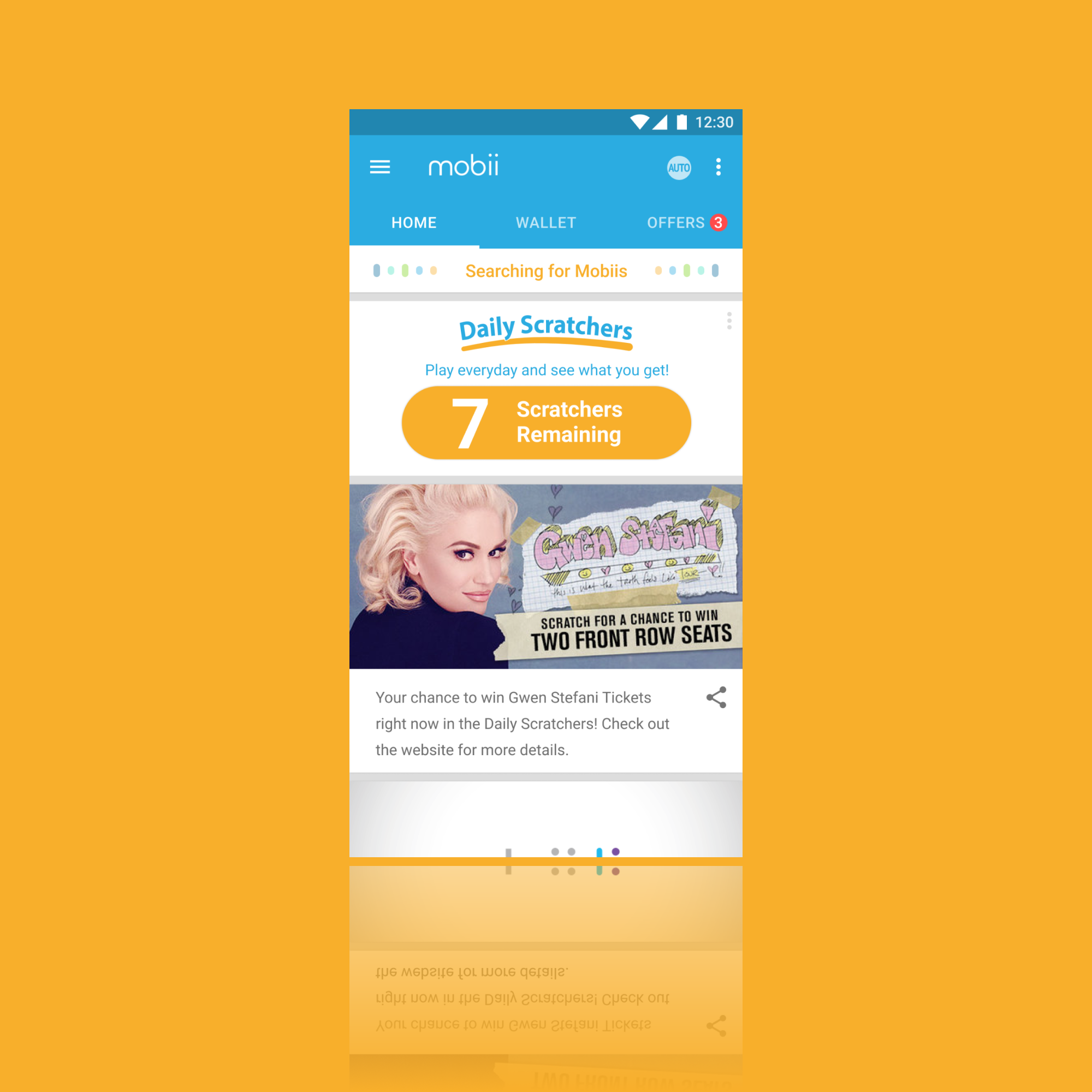
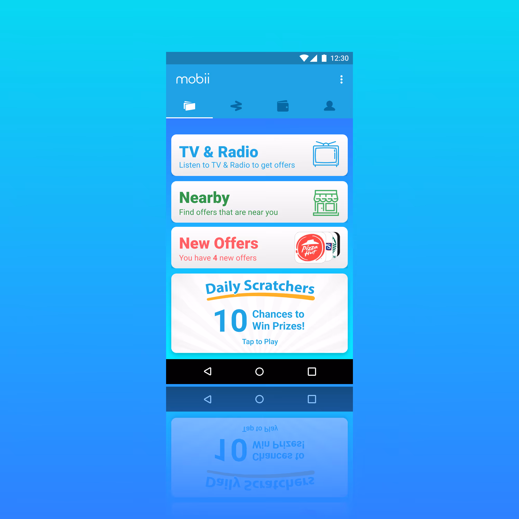
Content Feed
Relevant and Flexible Content
I designed a story card feature to replace the filtered content feed. These cards could be manipulated in the dashboard through a new Story Card View. This allowed for the content and design teams to create content in support of user interaction through micro-sites or in support of campaign from partnerships. I designed one for each type of available interaction —— static, content with details, and linked content.
- Immediate campaign support: Delivered relevant, actionable content in real time
- Sustained content pipeline: Provided ongoing assets to pair with microsites
- Increased campaign visibility: Extended exposure for upcoming initiatives
- Cohesive cross-channel experience: Aligned seamlessly with social team efforts
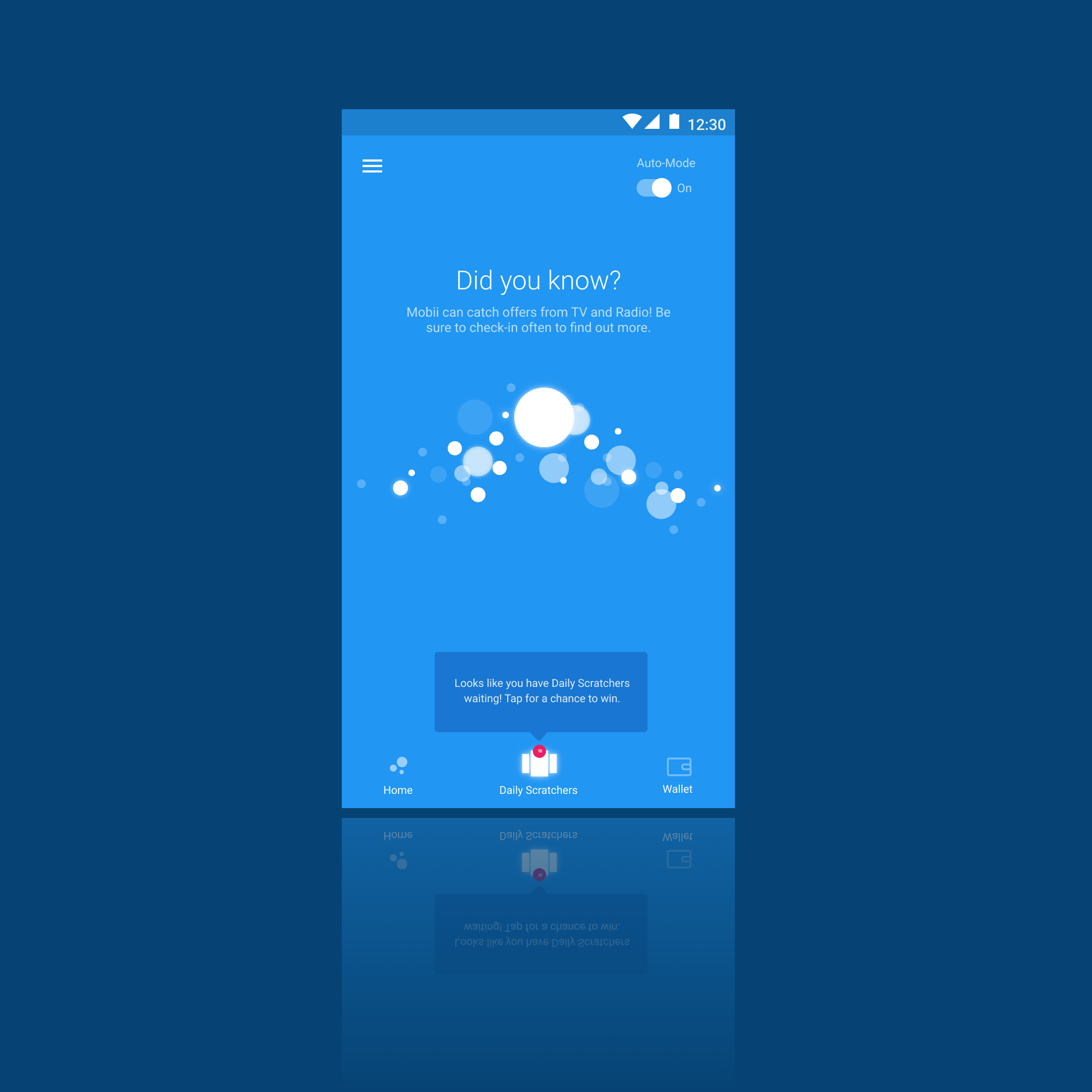
Triggered Content
Evolving Targeted Content
We also needed a fuller, more dynamic and long-term solution, so after the Story Card Feature I designed a Targeting, Category, and Tag set of components on the dashboard that would increase relevance over time automatically. Triggers could be would be weighted through user actions (more engagment, more content type) and targeting which would automatically send relevant content to the right users and only get better over time.
- Increased relevant content would have increased engagement
- Eventually the platform would choose content itself based on availability
- Combined with Story Cards and the new experience, I aimed for a long-term product solution

Simple Visual Language
Simplified Content Direction
I developed a visual language which emphasized simplicity. Using Sketch I built out a basic template set so that the team could stay relatively cohesive. I had three core objectives for this direction:
- Simplified experience: Designed for easy consumption to address low user interaction
- Shared creative workflow: Unified team collaboration through Sketch
- Structured asset control: Managed versioning and consistency via Abstract
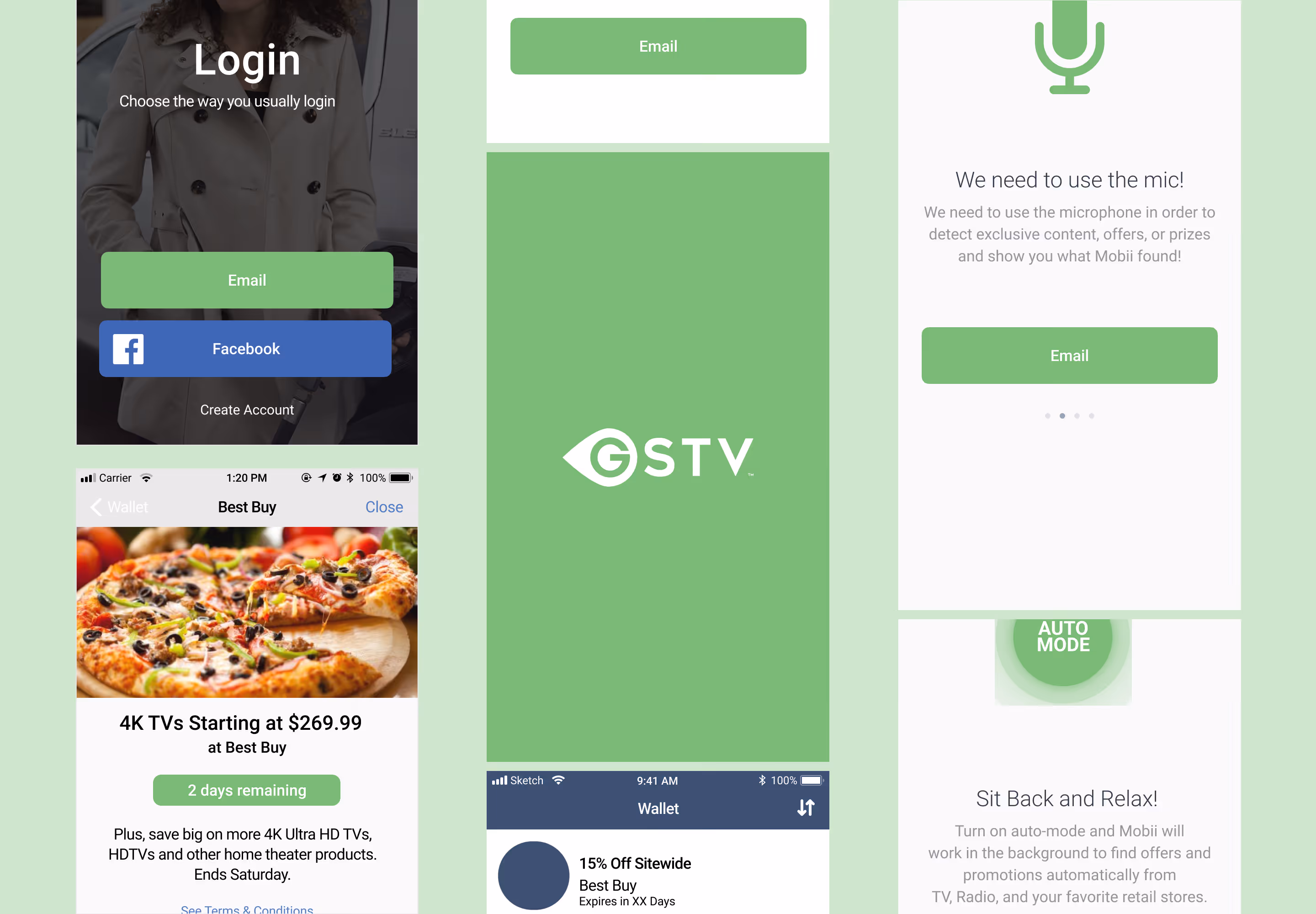
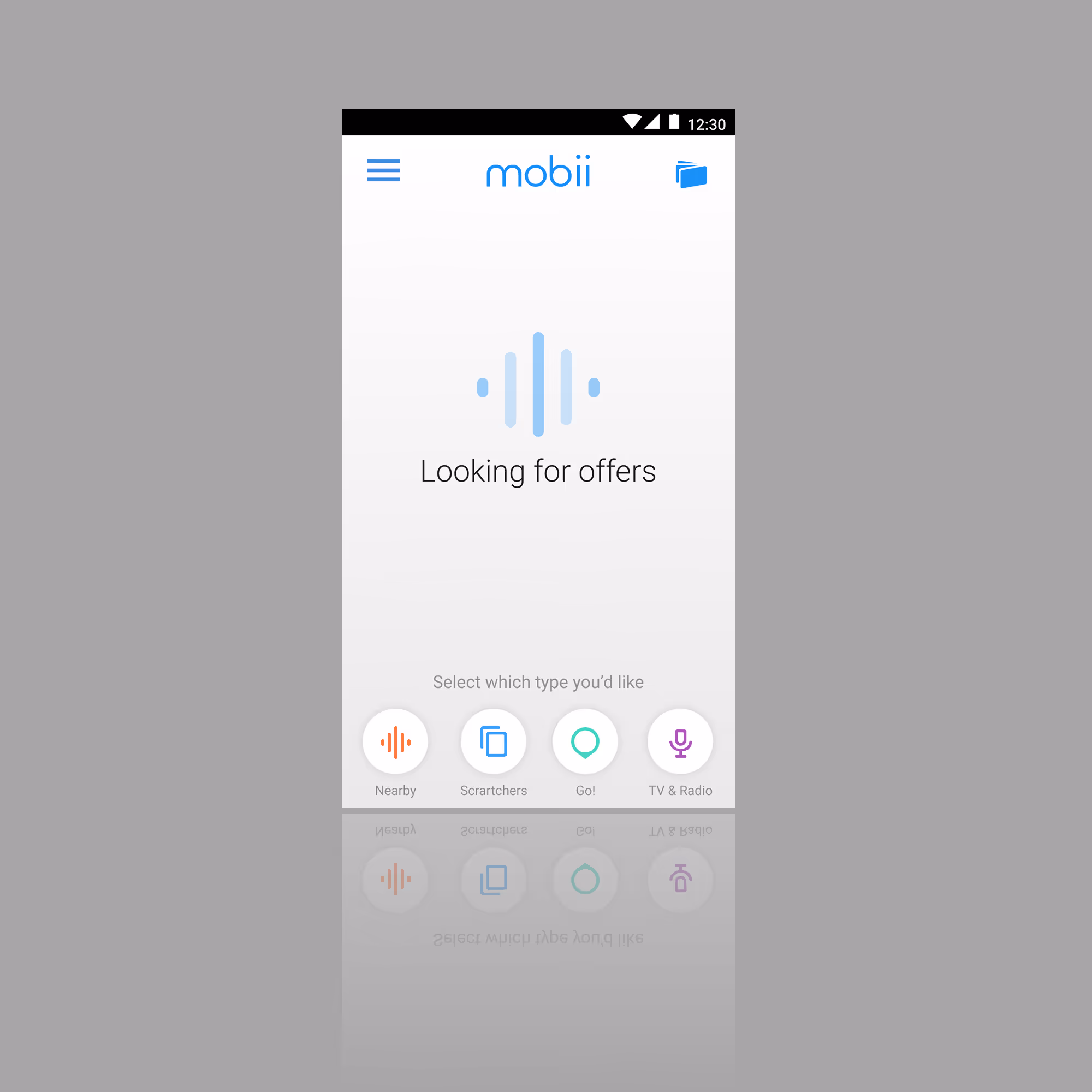
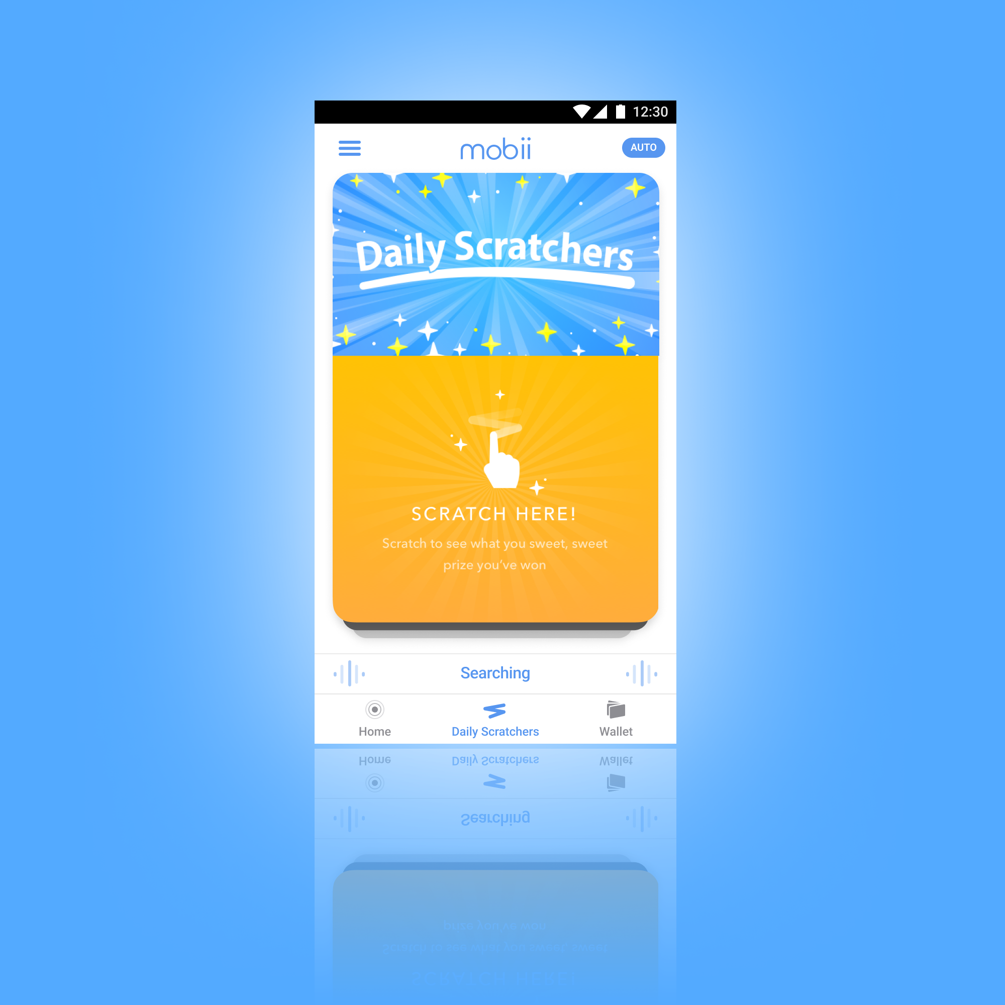
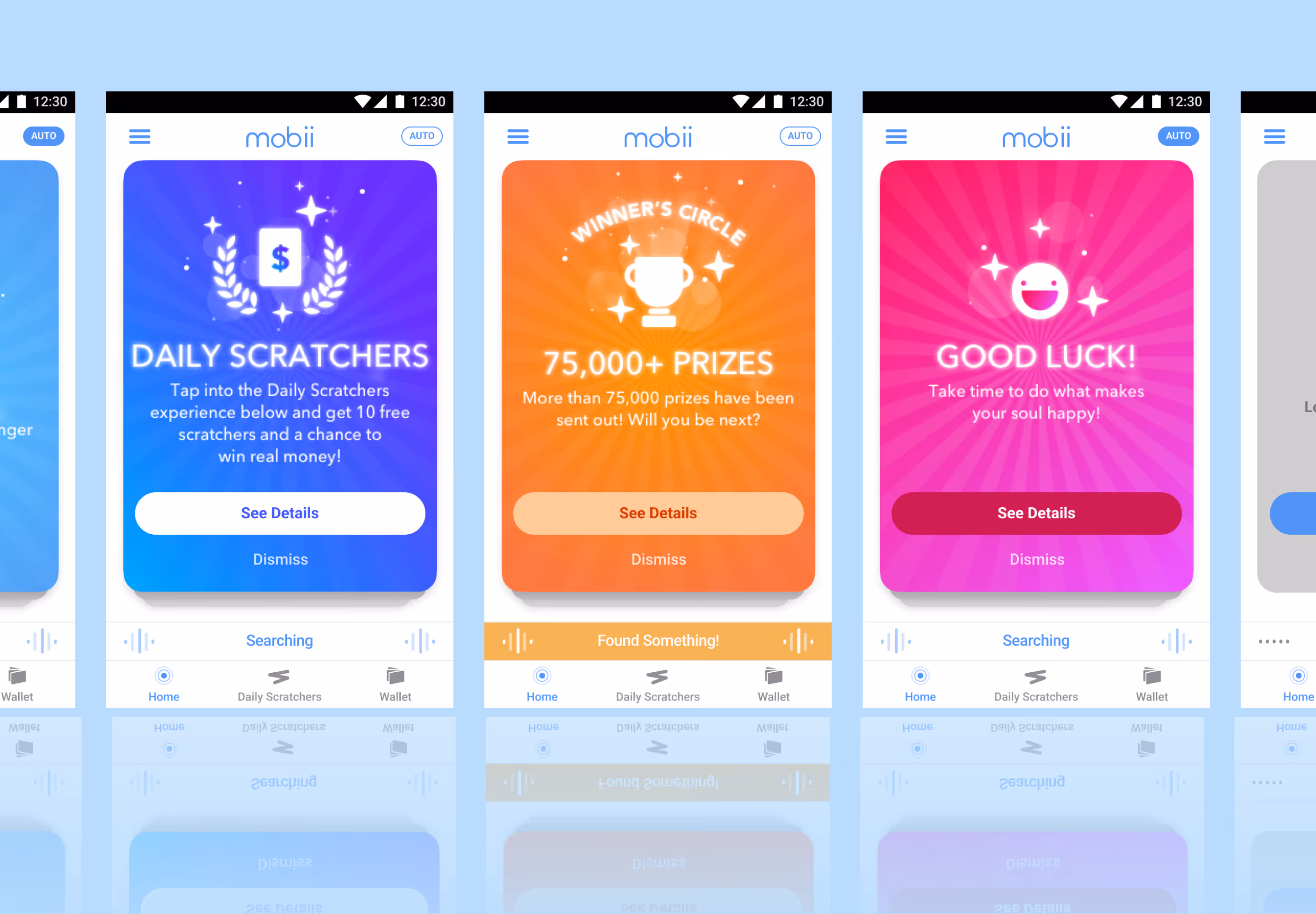
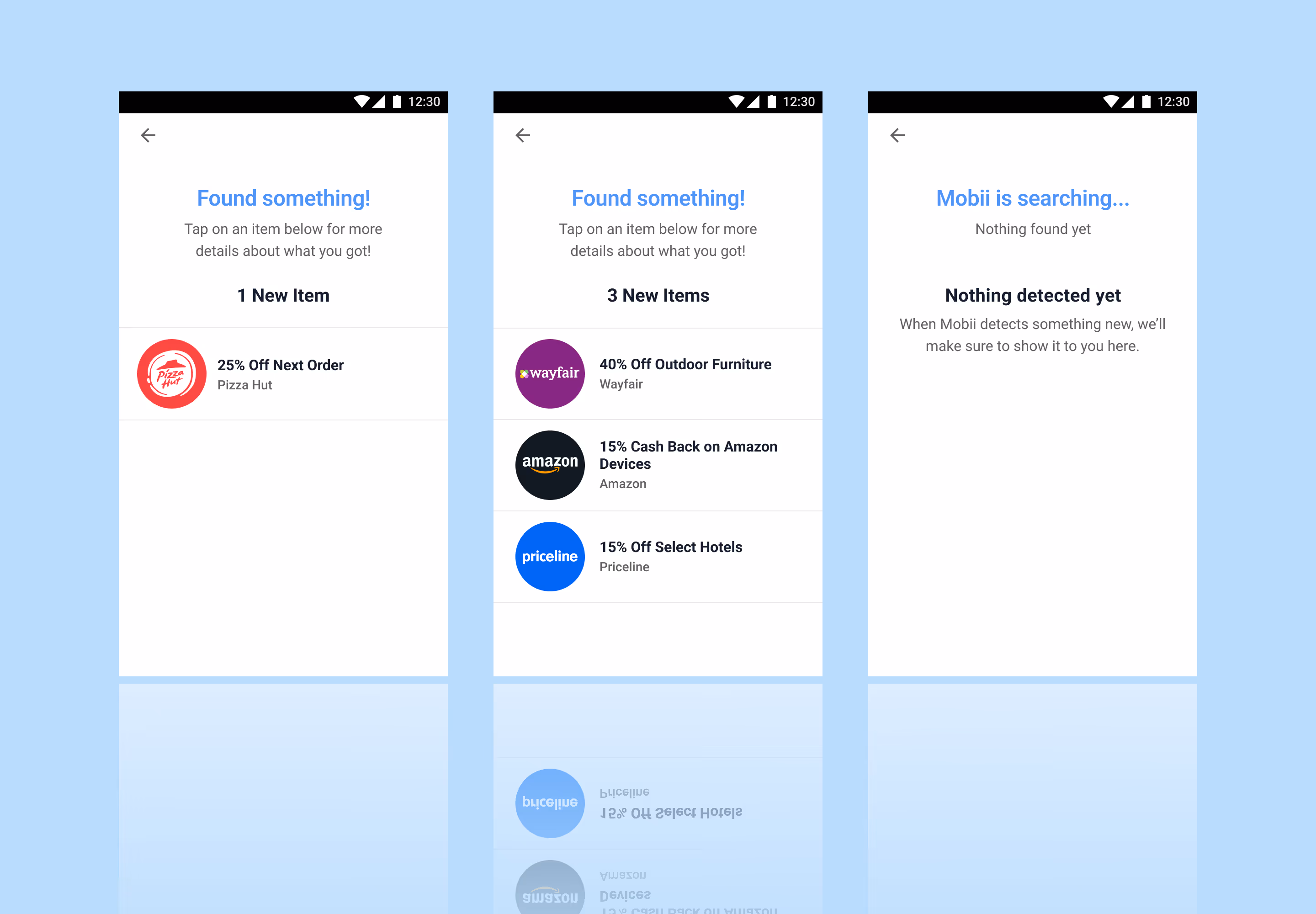
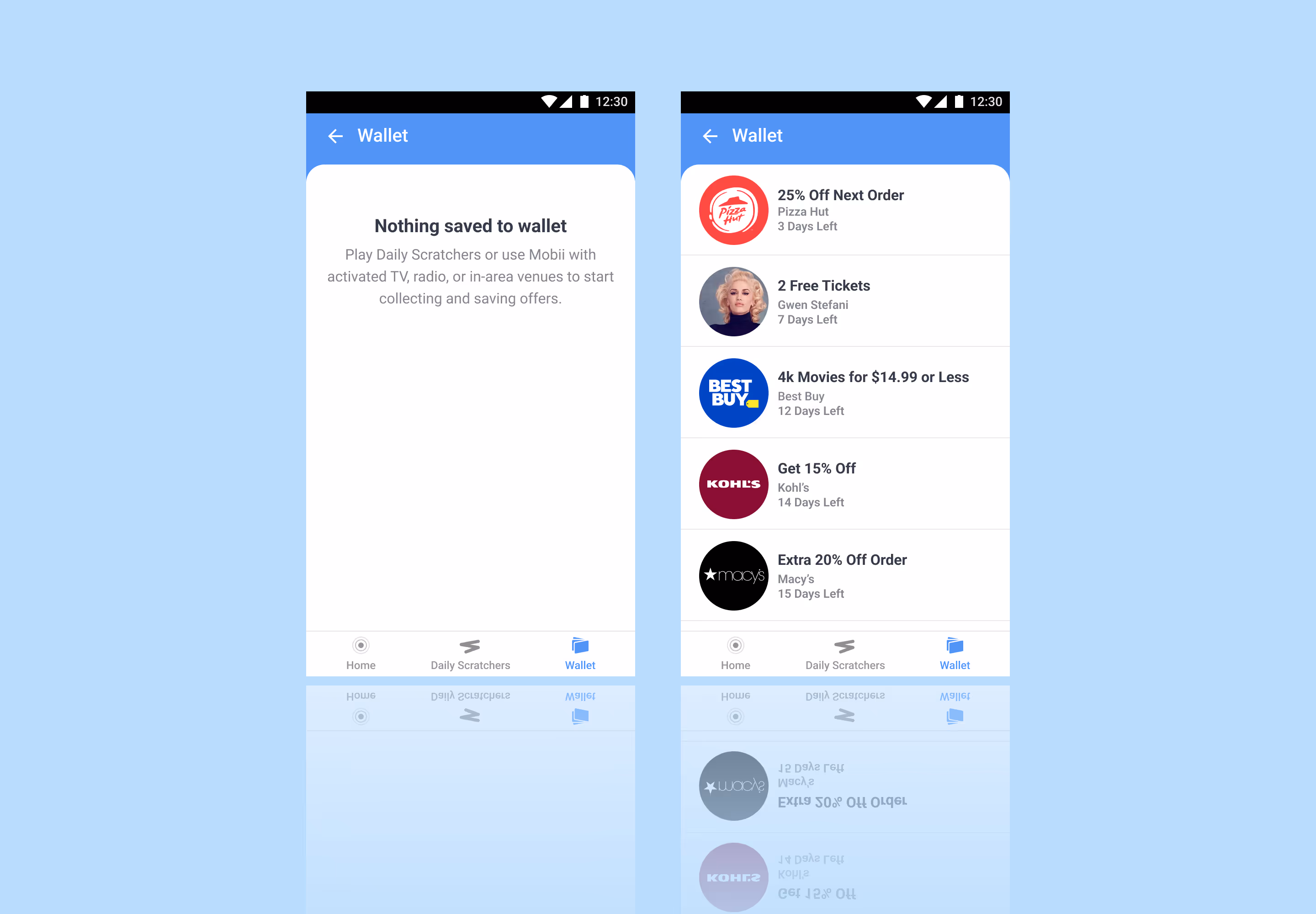
Detection Drawer View
Persistent Collection Wallet
Being that low content engagement was the primary issue, I designed a detection drawer view that would bring content directly to the user.
- Reduced friction discovery: Content surfaces directly within the interface, minimizing effort and increasing engagement
- Expanded, low-pressure collecting: Continuous collection groups present more options without overwhelming the user
- Contextual relevance: Drawer delivers timely, targeted content aligned with user behavior and intent
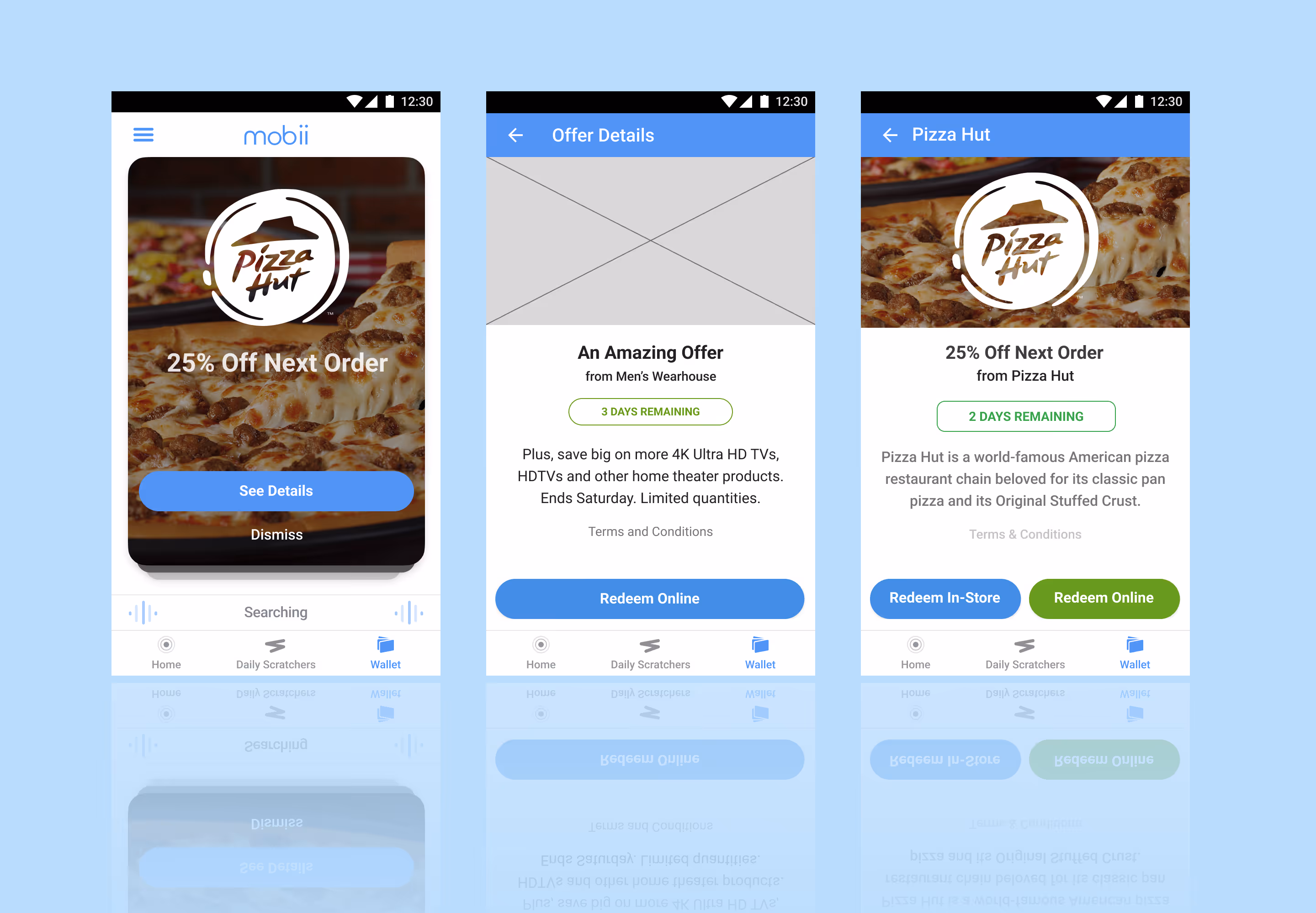
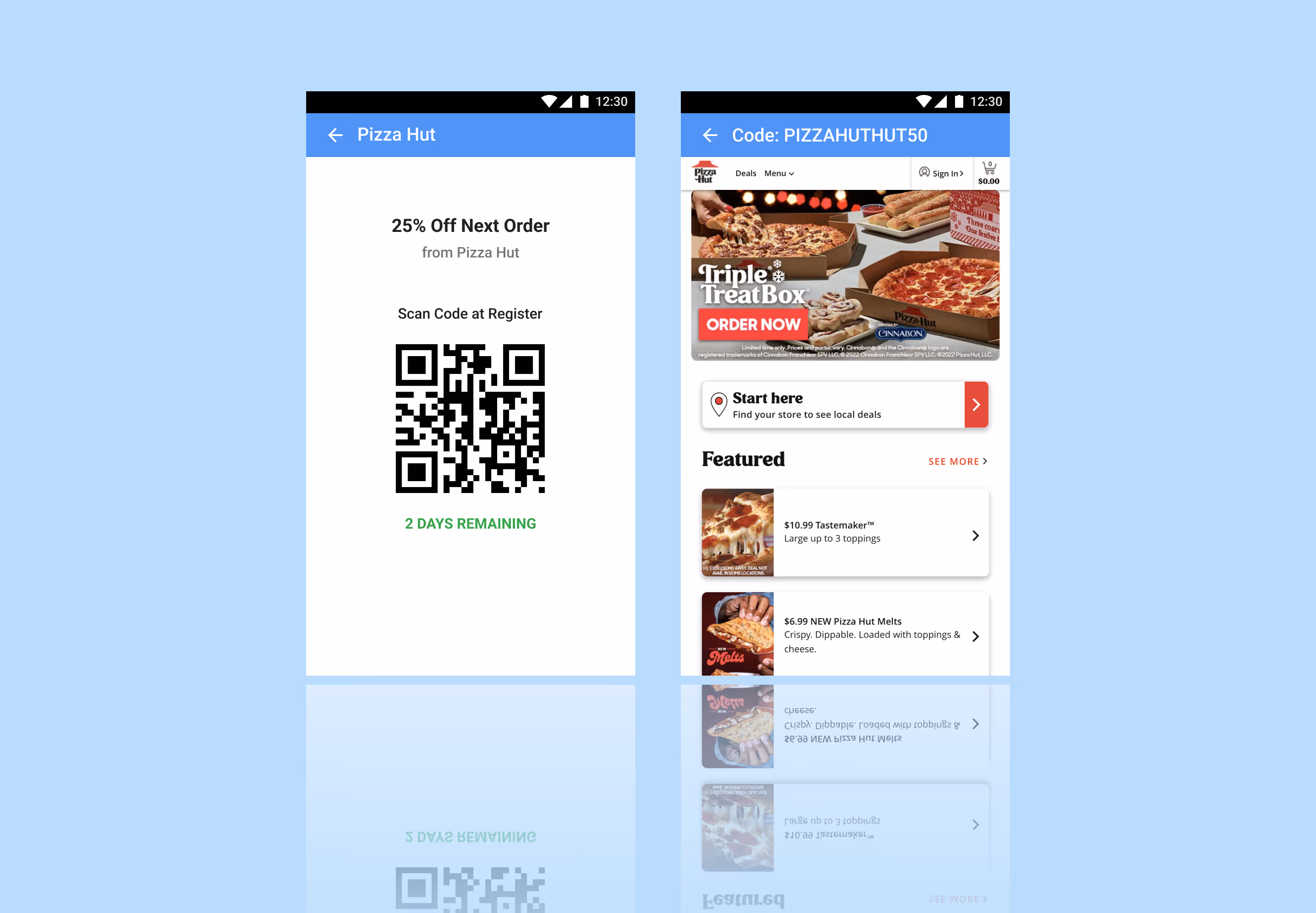
Redemption Views
Redemption
To streamline the final step of the experience, I designed flexible redemption views that clearly present either an in-store code or an online attached offer code, ensuring users can act immediately with confidence.
- Clear action pathways: Distinct in-store and online states remove ambiguity and guide users to the correct redemption method
- Immediate usability: Prominent, ready-to-use codes reduce friction at the moment of conversion
- Context-aware presentation: View adapts based on offer type, ensuring relevance and clarity across redemption scenarios
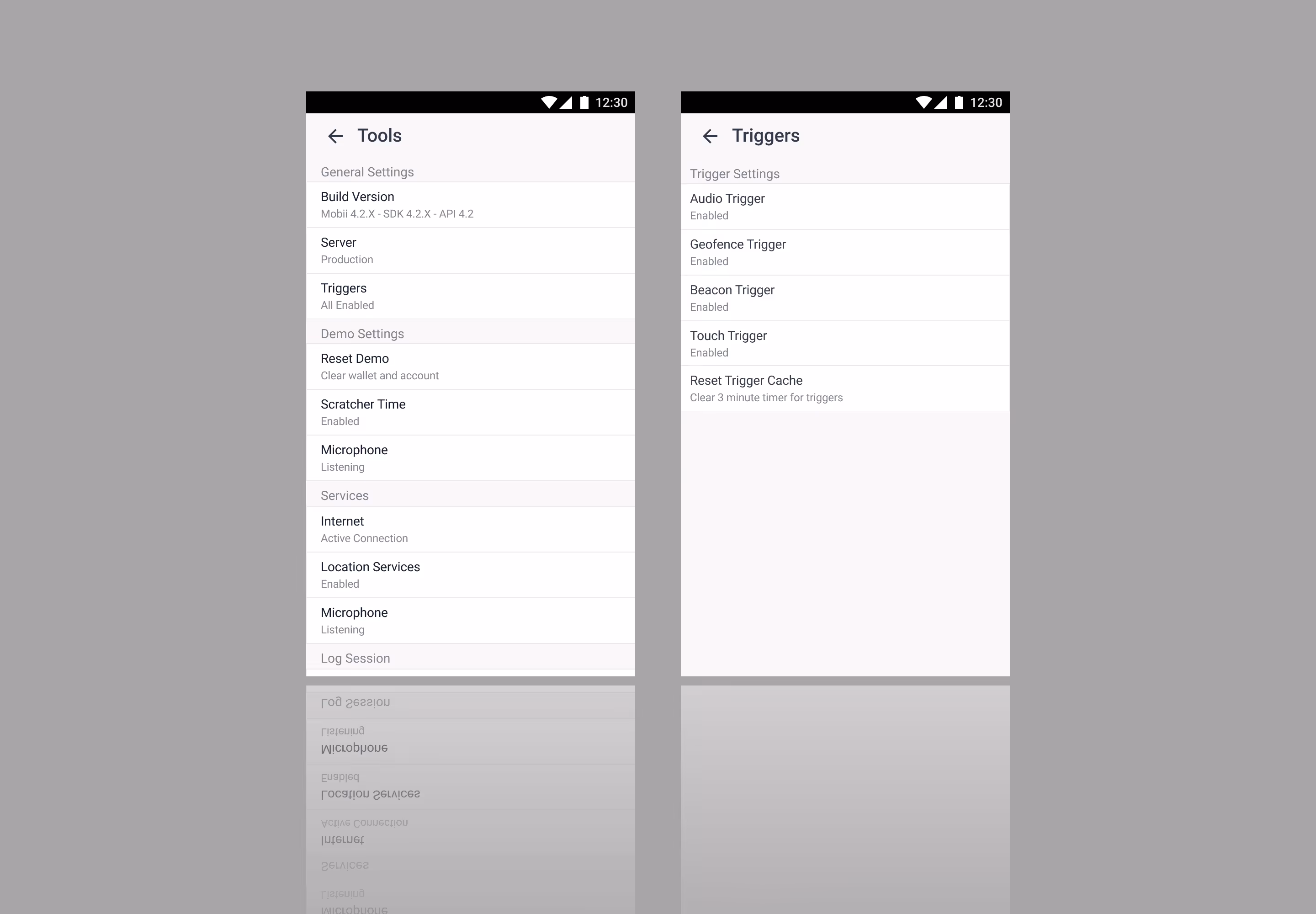
Quality Assurance View
Developer (QA) View
I designed a developer or quality assurance (QA) view to help with troubleshooting to help reduce the back-and-forth when working on updates.
- Aligned development handoff: Clear, accurate sharing of environments with developers
- Controlled feedback modes: Toggleable settings to scope and focus feedback
- Stronger cross-functional clarity: Improved alignment across business, product, and communication streams